 The live map, in English. The official maximum-class scenario on a 250 m government mesh, no verdicts.
The first time I went on a holiday in Japan, I visited Kochi City. Sleeping at a friend's house there, I noticed something peculiar: everyone slept with their doors open at night. When I asked my friend about it in the morning, he told me that everyone in the area knows a particularly strong earthquake is coming, and that if the doors are closed when it hits, people could be trapped inside. That was my first encounter with the words "Nankai Trough."
Ever since then, I have been extremely careful about earthquakes. Living in Tokyo, I still go into full panic mode when one happens, no matter how small.
I think Japan is amazing, but I noticed a pattern. The further people believe they are from the Nankai Trough, the more relaxed they seem when an earthquake happens. In my opinion, that is not a good thing. The projected shaking intensity for central Tokyo is 6 upper on the JMA scale. That means it is impossible to stay standing.
Because of that, I decided to make the government's own hazard data usable. First as a clean, queryable dataset that stays current as the official figures change, then as a bilingual map anyone can open to find their own area.
I designed it for two readers. The foreign resident who cannot read a Japanese-only hazard PDF (Japan has over three million), and the long-time resident who quietly assumes that distance from the coast means safety.
Those two needs pull against each other. The map has to be legible to someone who has never heard of the shindo scale, and precise enough to unsettle someone who feels safe in central Tokyo. Most of the interface decisions below come from holding both at once.
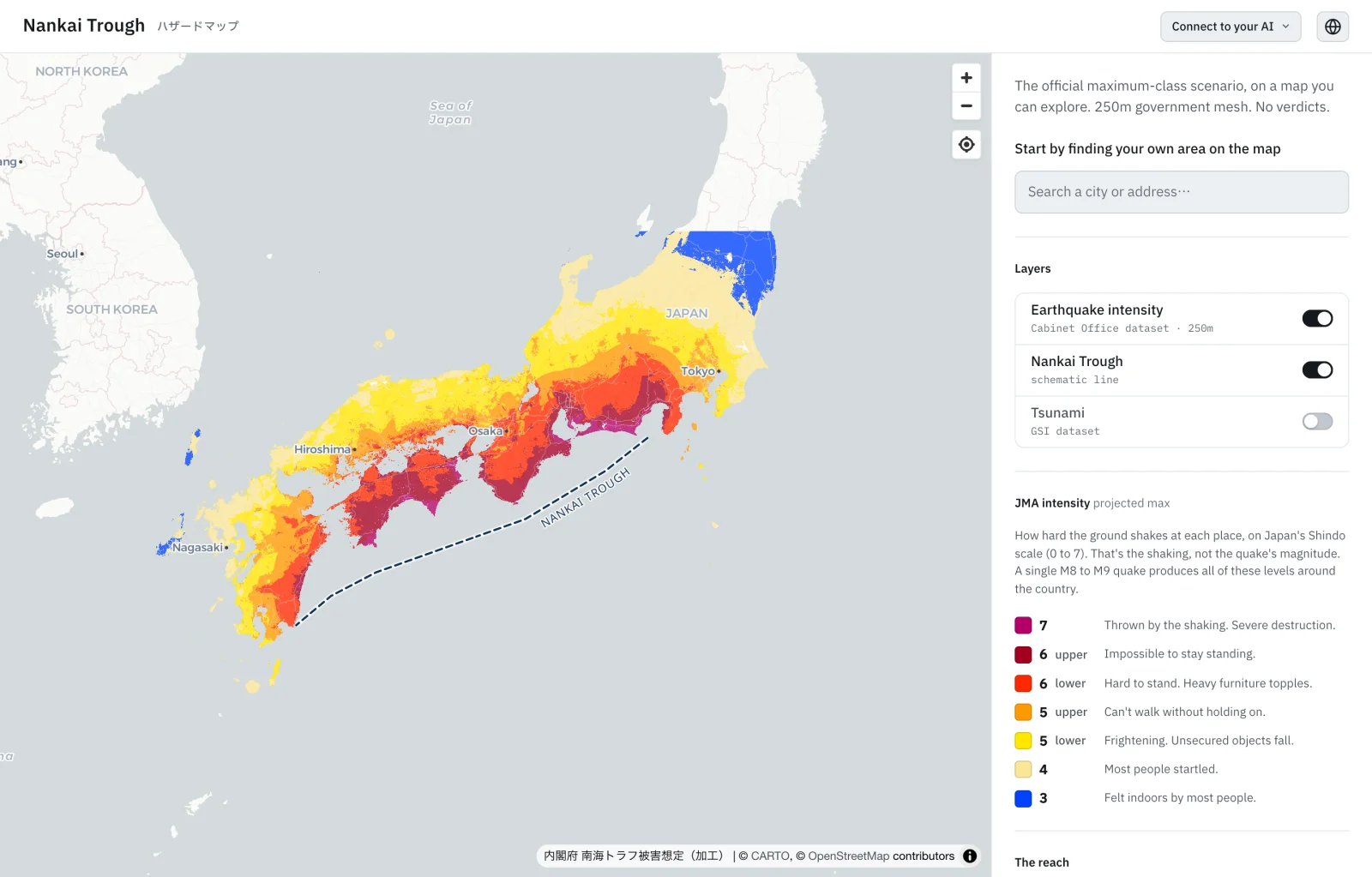
The Nankai Trough is a subduction zone off the Pacific coast of Japan. The government projects a magnitude 8-9 earthquake within the next 30 years at high probability. The official hazard data exists, but it is buried across multiple government PDFs, spreadsheets, and agency websites. Anyone wanting to check the projected shaking intensity at their own address has no single place that shows it clearly.
It is not even one dataset but two, shaking and tsunami, from different agencies and on different terms, joined only by the single quake that triggers both. Nothing about it lines up on its own.
The map is the part people see, but it is not where I started. Underneath it is a separate data engine: every official figure pulled into one cited, dated source of truth that stays current as the agencies revise their projections. I built that first.
On top of the engine sits an MCP server, so the same cited data is open to any AI assistant, not only the map. That is where it reaches past what a map can do. Someone can give it a real building, a reinforced-concrete apartment in Gumyouji, Yokohama, built in 1979, and it places that in the right seismic-code era (旧耐震, before the 1981 standard), then points to subsidised, often free, seismic diagnosis and retrofit programs. The map answers where and how strong. The conversation answers what it means for one specific home.
The map is one view on that engine. The engine is the project.
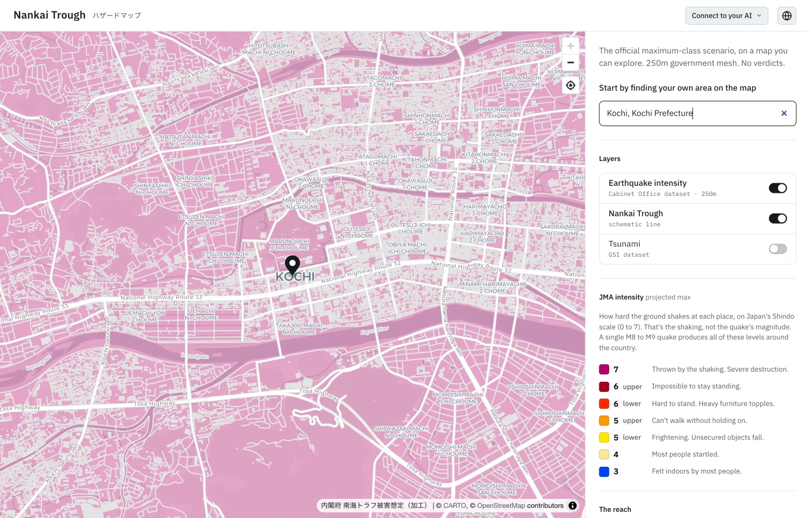 Search any address. Here Kochi, the city from the opening, rendered at street level in its projected intensity.
Government data only
The most important aspect of this whole project is data truthfulness. Every number on the map comes straight from the Cabinet Office (内閣府) or the Geospatial Information Authority (国土地理院). It carries the official maximum-class scenario exactly as published, and the source stays visible the whole time so anyone can check where a particular figure came from.
No safety verdicts
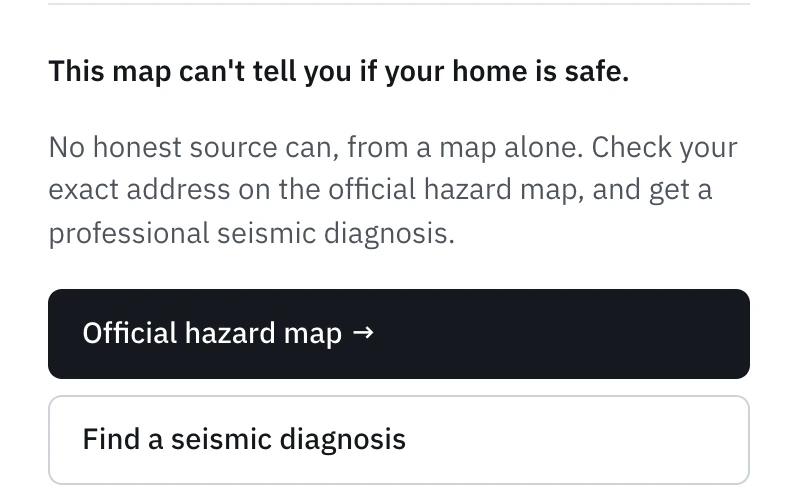
I made it a point that the map never tells anyone whether they're safe. A verdict like "your area: high risk" would feel helpful, but I'm not the authority on that, and no map knows whether a given building will hold. So the map merely shows the government's projected intensity for the address.
Two hazards, one surface
Shaking and tsunami are not the same hazard, and I didn't want to blend them into one scary blob. They come from different agencies, in different units, over different geography. Earthquake intensity is the JMA shindo scale on a 250-meter mesh from the Cabinet Office; tsunami is water depth and reach along the coast from the Geospatial Information Authority. The only thing they share is the single quake that sets both off. Each one is its own toggle layer, intensity is on first because it reaches the most people, and the legend stays on screen the whole time.
Bilingual by default
Almost all earthquake-preparedness material in Japan is Japanese-only, which leaves out more than three million foreign residents, the people most likely to miss a warning in the first place. So the map works fully in English and Japanese: not just the buttons, but the layer names and the entire intensity legend. It initially reads the user's browser language to decide which to open in.
Read together, the official figures are blunt. A single magnitude 8-9 quake projects intensity 7, the top of the scale, across 72,639 cells of the 250-meter mesh, in one arc from Shizuoka through Shikoku to Miyazaki. 764 municipalities across 31 prefectures face intensity 6-lower or above, or a tsunami of three meters or more. In September 2025 the government's earthquake committee revised the 30-year probability away from a single 80 percent figure to a two-model range: 60 to 90 percent or higher on one model, 20 to 50 percent on the other. The map carries the revised numbers, not the rounder old one.
The map's only job is to make that legible at the scale of one address, without softening it and without crossing into a verdict.
There is no usage analytics on it, by choice. The outcome I actually care about is narrow: whether one person, after finding their own address, changes a single preparedness decision. That is the next thing worth testing.
The dataset ships as an MCP server on npm, nankai-trough-mcp, updatable as the official figures change. The bilingual map that renders it is live at nankaitrough.bymarsel.me. The project was fully built with Claude Code.
npm · nankai-trough-mcp nankaitrough.bymarsel.meI live in Japan. The Nankai Trough earthquake is not hypothetical to me. I wanted to understand the data for myself, and once I did, the gap between the raw government files and what a normal person can actually use felt too wide to leave alone. Data should be easily read visually for better understanding.