Case study
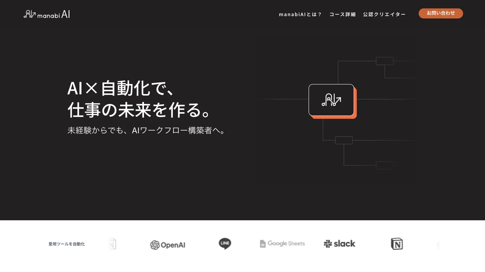
manabiAI
The landing site for PANTHEON's course in AI and n8n workflow automation. PANTHEON supplied the content; I owned the layout, the visual system, and the look, aimed at a young, AI-fluent audience and clean enough to make a paid course feel worth it.
Summary
- Background
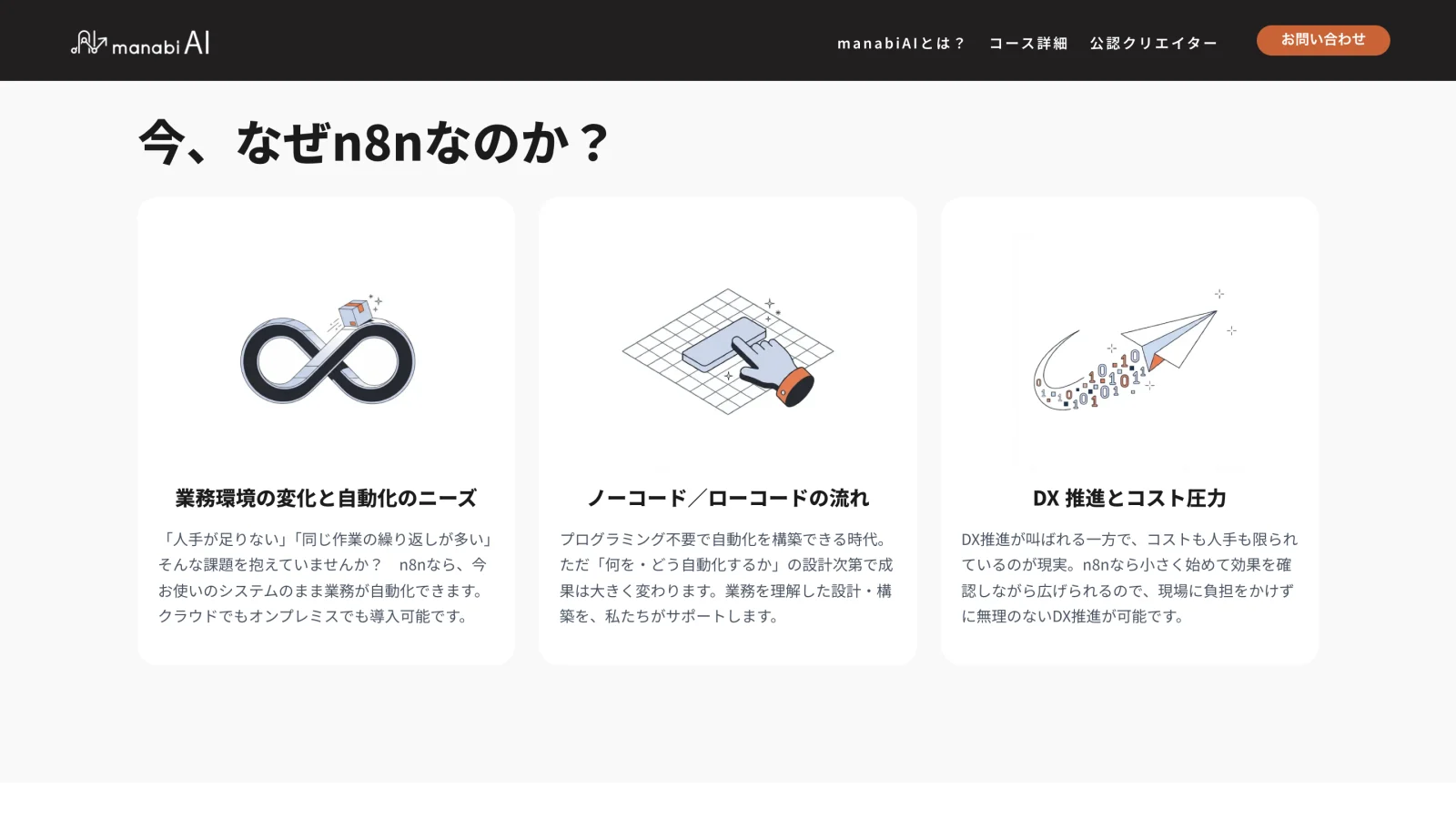
- PANTHEON launched a course in AI and n8n workflow automation.
- Problem
- The site had to give a trending skill a current, credible face for a young, AI-fluent audience.
- Approach
- PANTHEON supplied the content; I owned the layout, visual system, and look, carried by a custom illustration set.
- Outcome
- A live landing site at manabiai.jp.
The brief
manabiAI is the landing site for PANTHEON's course in AI and n8n workflow automation. PANTHEON supplied the content; I owned the layout, the visual system, and the look.
The audience was young and AI-fluent, and the skill was trending, so the site had to read as current and credible from a traditional company. It also had to be clean enough to make a paid course feel worth it.
Walkthrough
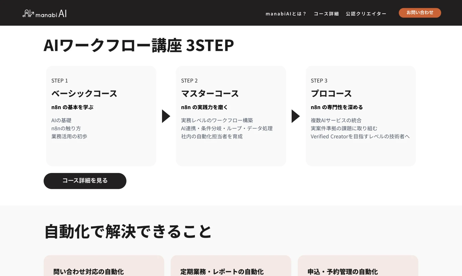
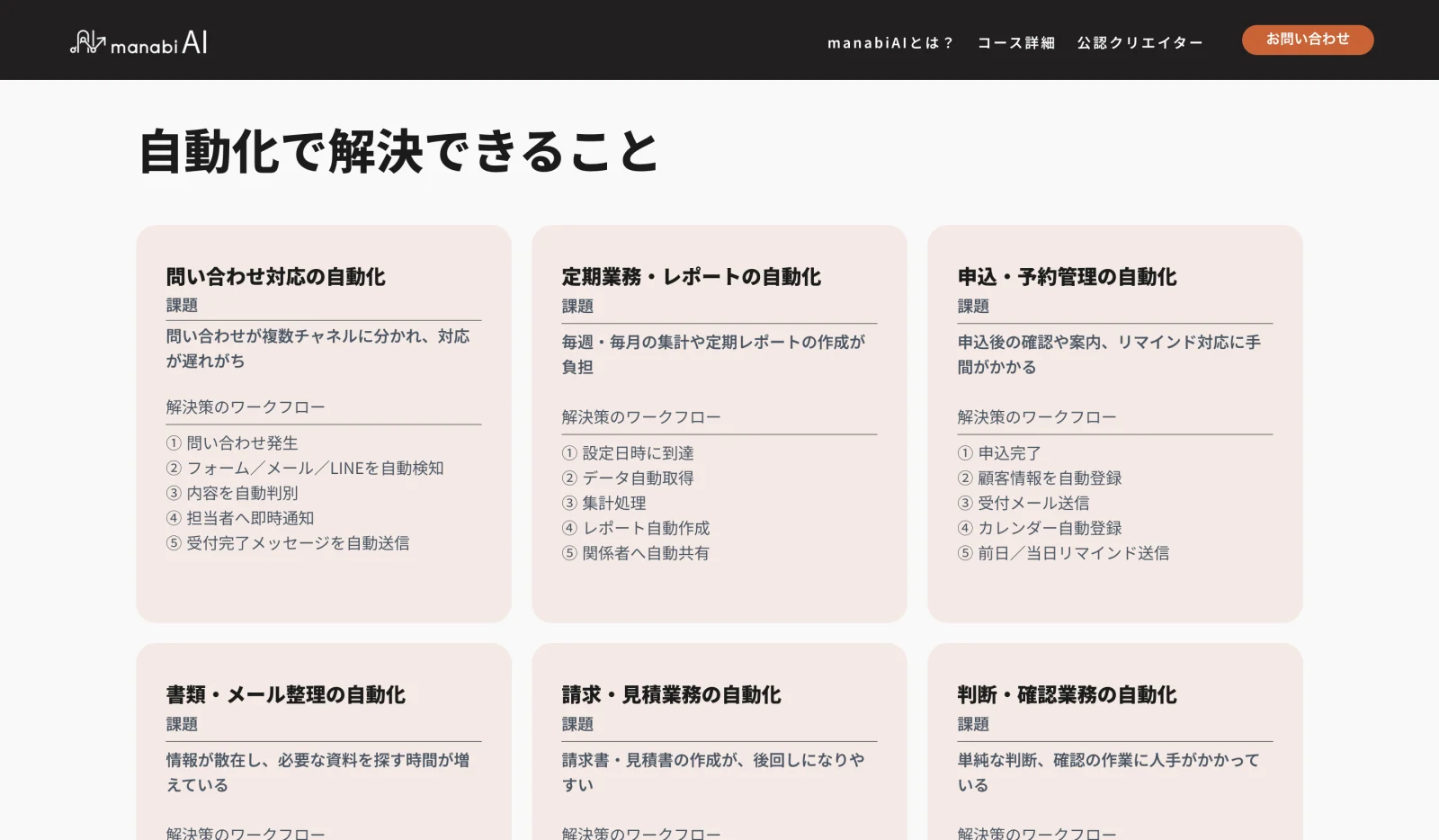
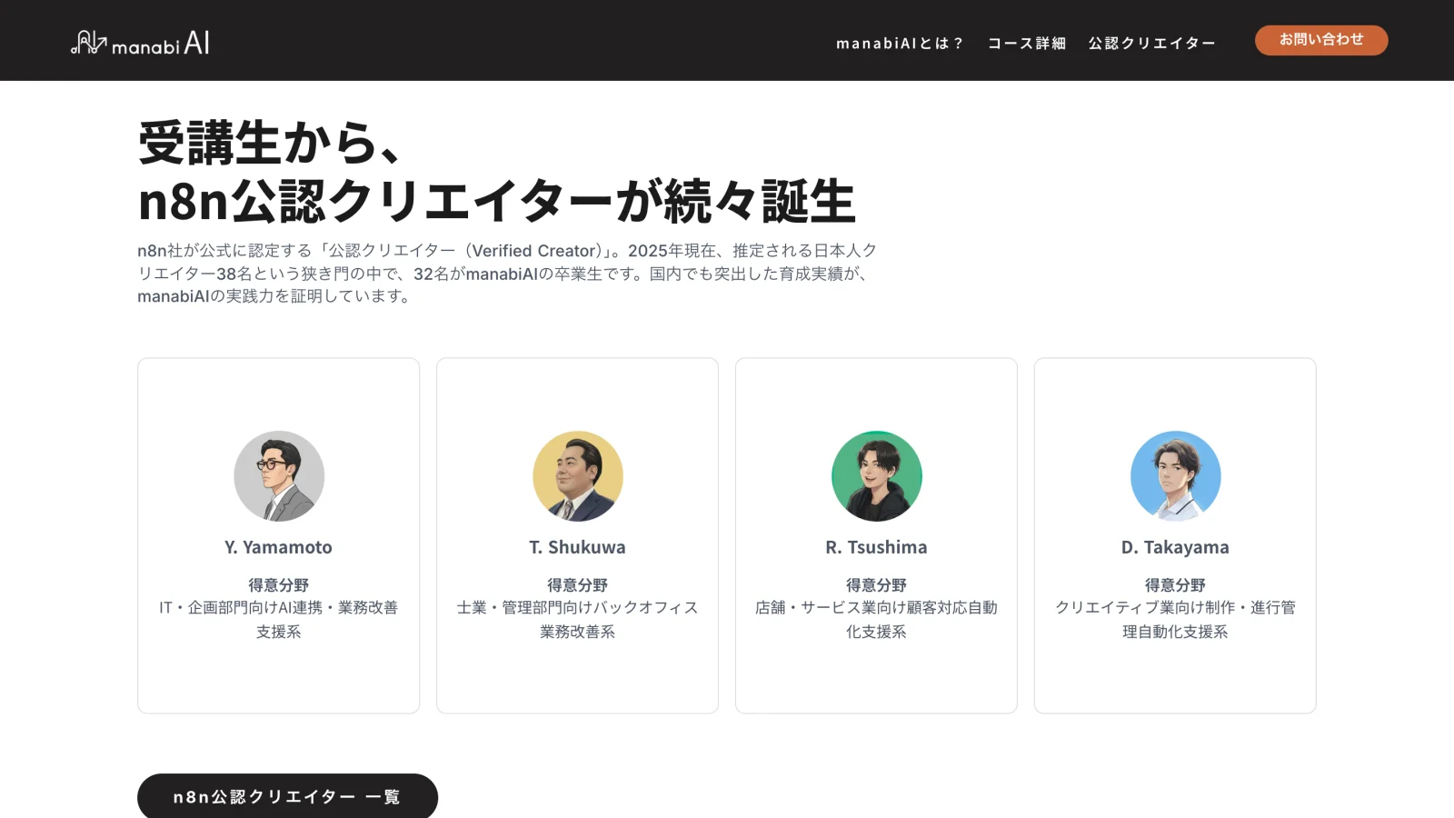
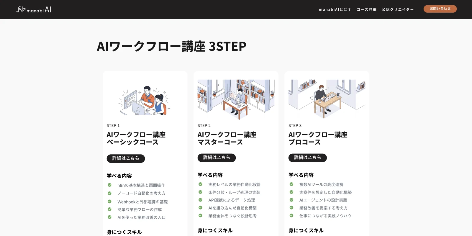
The layout moves from the pitch into why n8n, the course path, what automation solves, proof, and pricing, with a custom illustration set carrying the visual system throughout.
Reflection
This one came with a twist: the client wanted the final design built in Studio.design, not Figma or Adobe XD, my usual tools. They chose it because it plugs into their CMS more easily. That meant learning a new tool from scratch, so finalizing the design took a little longer than usual. The hardest part was the responsive work, which took several rounds of experimenting to get right. Beyond picking up a new app, I really enjoyed researching how to design for the Japanese market.