Case study
Miraidukuri
Product and visual design for Miraidukuri Company, a Tokyo social enterprise reconnecting fragmented systems across tourism, regional revitalization, health, and circular economy. Tour site, booklet, mascot, and campaign identity featured.
Summary
- Background
- A Tokyo social enterprise working across tourism, regional revitalization, health, and circular economy, where I design every customer-facing touchpoint.
- Problem
- The tour site read as dated domestic editorial, fragmented tours across pages, and buried the details travelers needed to book.
- Approach
- Interviews with international travelers, then a consolidated one-tour-per-page IA and a premium visual reset, plus brochure, mascot, illustration, and campaign work.
- Outcome
- After launch the site converted real inquiries for the first time, though analytics were not instrumented for a clean before-and-after.
Context
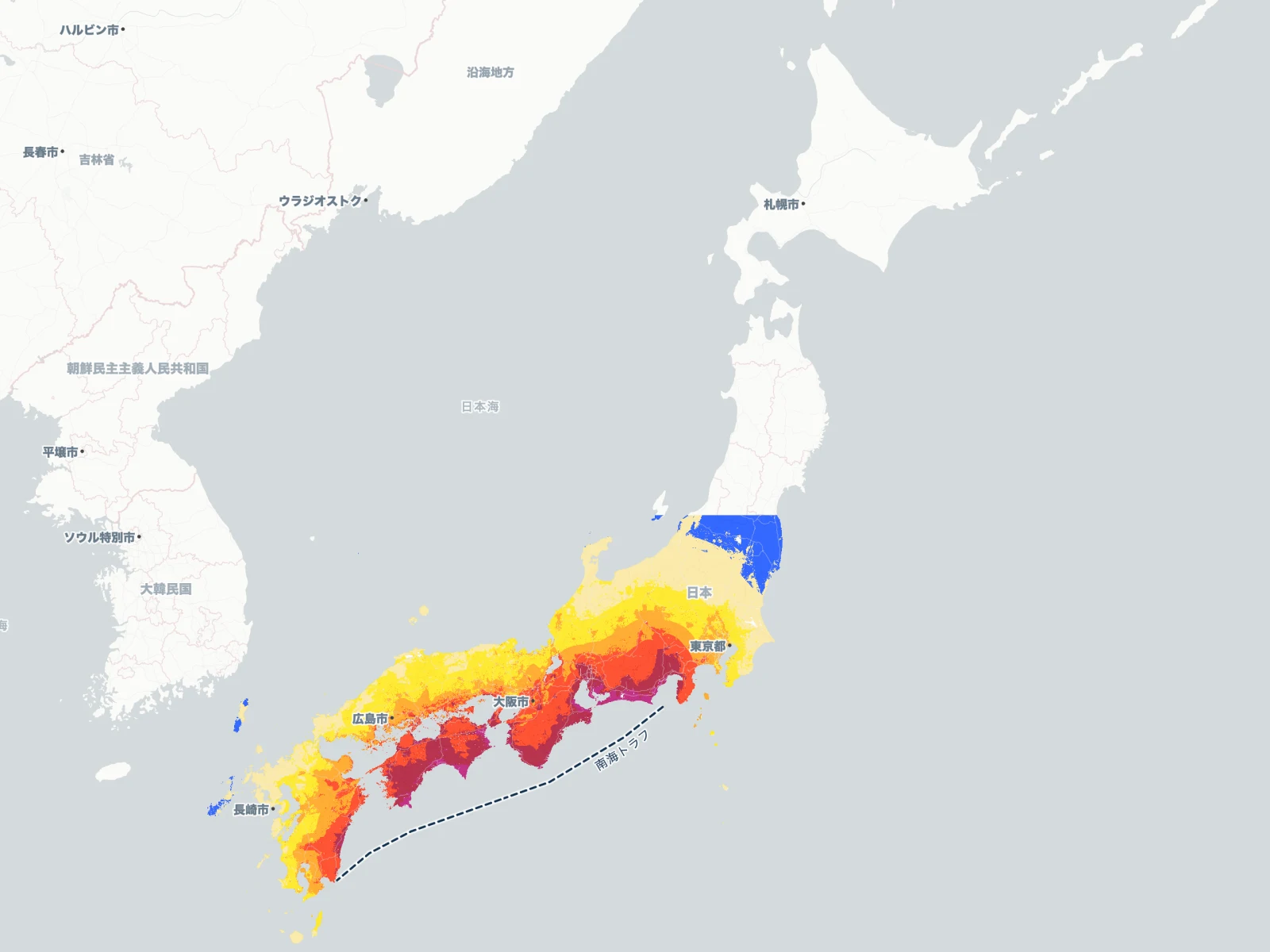
Miraidukuri Company (Mirai Creation Company) is a Tokyo-based social enterprise that solves fragmented social issues through cross-sector design. Their work spans four domains: tourism and cultural experiences, regional revitalization, preventive health and food, and distributed energy and circular economy.
I handle design across customer-facing touchpoints there: web, illustration, brochures, posters, social, video. Anything design related.
Featured here is a slice of that work: the bilingual tour site revamp, a partner brochure, a mascot character and illustration system, a standalone campaign site with original artwork, and a video produced for the YouTube channel.
Two disciplines run through it. The tour site is a product case with research, IA, and conversion decisions. The rest is visual design: booklet, mascot, illustration, video, and campaign identity. Both are below.
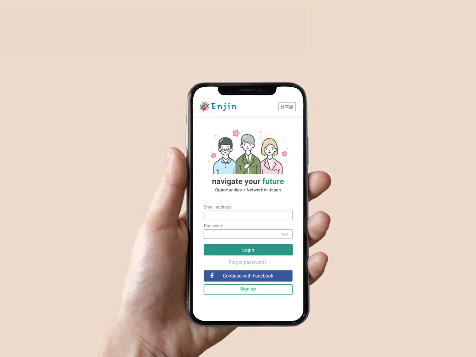
exp.miraidukuri.co.jpTour site
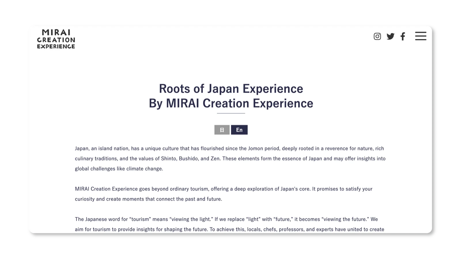
A bilingual site for international travelers booking premium cultural experiences in Japan. I designed the full UI and handed it off to a developer for build. The site needed to balance editorial warmth with clear conversion paths for tour bookings. The revamp launched in Q1 2025.
exp.miraidukuri.co.jpResearch
I ran 7 moderated interviews with international travelers in late 2024, before the revamp started. The target group was the audience the tour site needed to convert: English-speaking visitors researching cultural experiences in Japan. Three problems kept surfacing: the design felt outdated and did not match a premium travel brand, the tour structure felt confusing with too many variants to compare, and key booking details were buried too deep to reach without friction.
Decisions
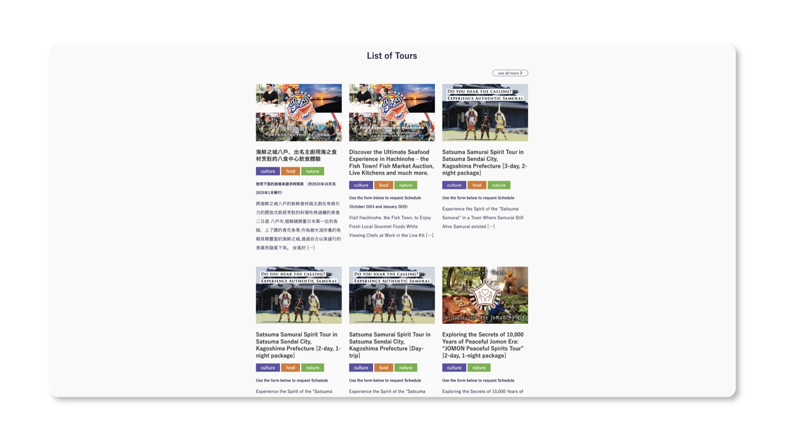
One tour, one page
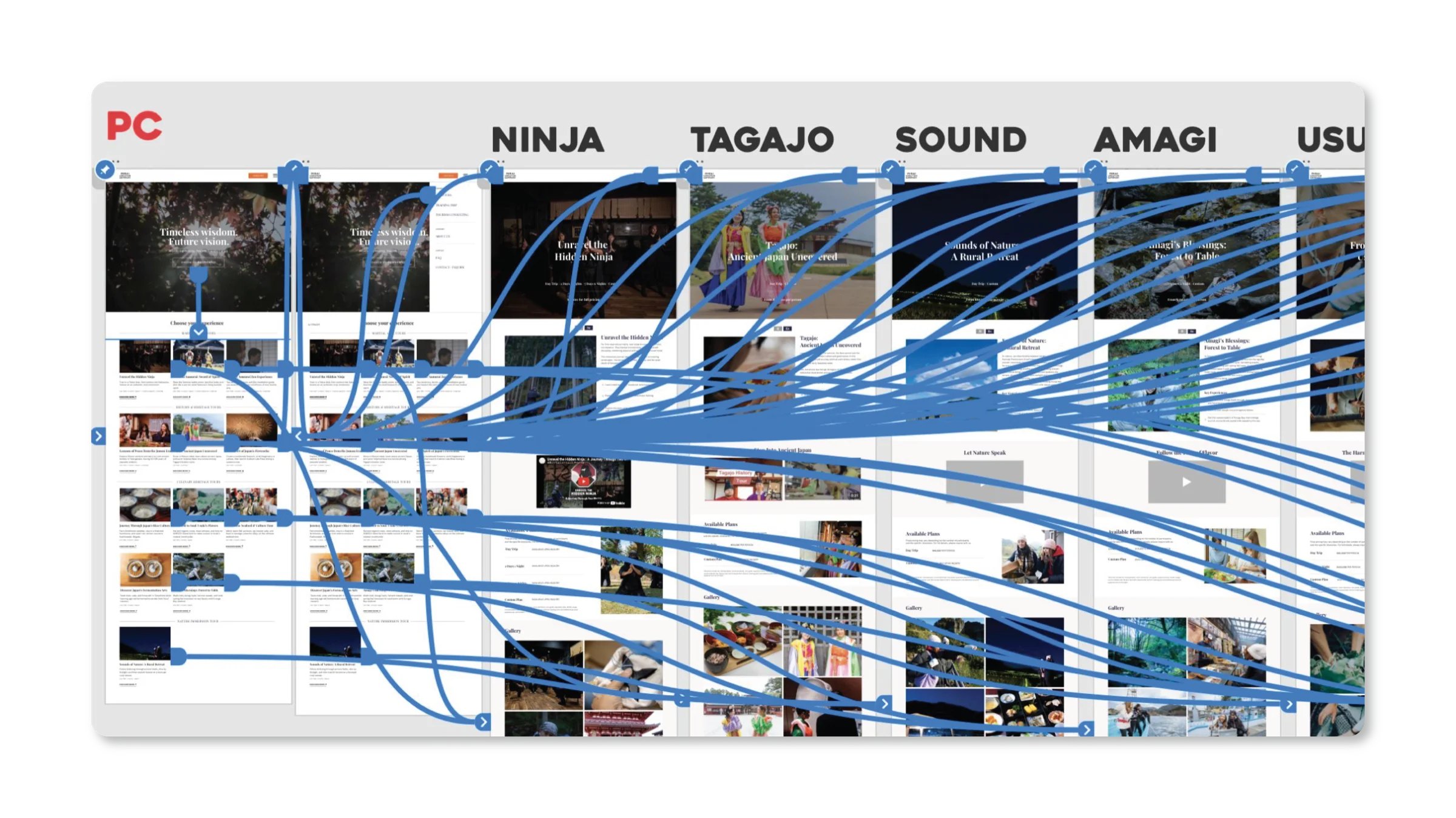
The old site fragmented each tour across multiple pages: different day-length variants as separate clickables, with Japanese and English versions living in parallel. Travelers could not compare variants side by side and bounced between pages looking for the right fit. I consolidated every tour into a single page with day-length options selectable inline, and replaced duplicate language pages with a bilingual toggle. One tour, one destination, one decision surface.
Details before clicks
International travelers landing on the old site needed three clicks minimum before reaching the information they actually needed to book: category, then tour index, then description. I restructured each tour page so the first view surfaces what drives the booking decision: itinerary, day-length, price range, photos. The highest-friction decisions now happen above the fold, not three pages in.
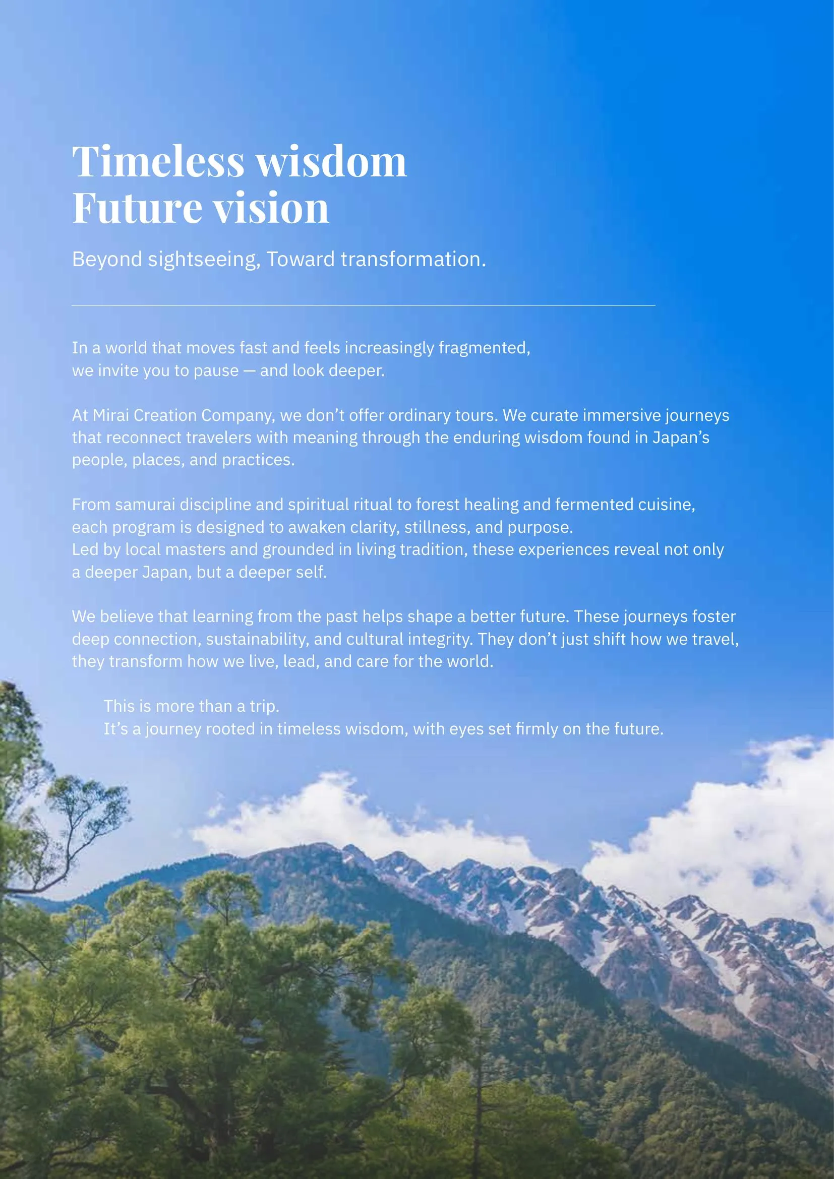
Visual language for inbound travelers
The old site read as long-form domestic editorial: stamp-style logo, text-heavy article layouts, dated typography. It did not match the premium cultural-experience positioning the company targets for inbound travelers. I reset the typography, brought in cinematic tour imagery as the primary storytelling surface, and aligned the nav structure with the register of higher-end travel brands.
Outcome
Before the revamp, most tour photography on the site came from monitor tours I ran for feedback. Actual paid bookings were rare. After launch, the site started converting real inquiries for the first time. I do not have a clean quantitative lift to claim: analytics were not instrumented to compare before and after. A post-launch audit surfaced SEO metadata gaps outside the design scope, including missing hreflang tags and incomplete Open Graph data.
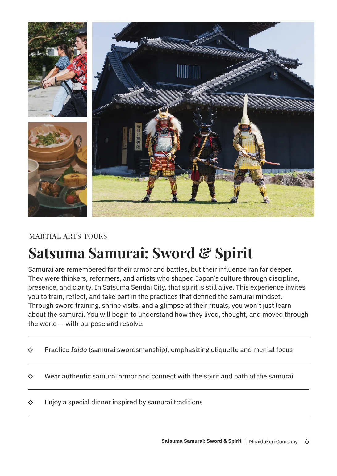
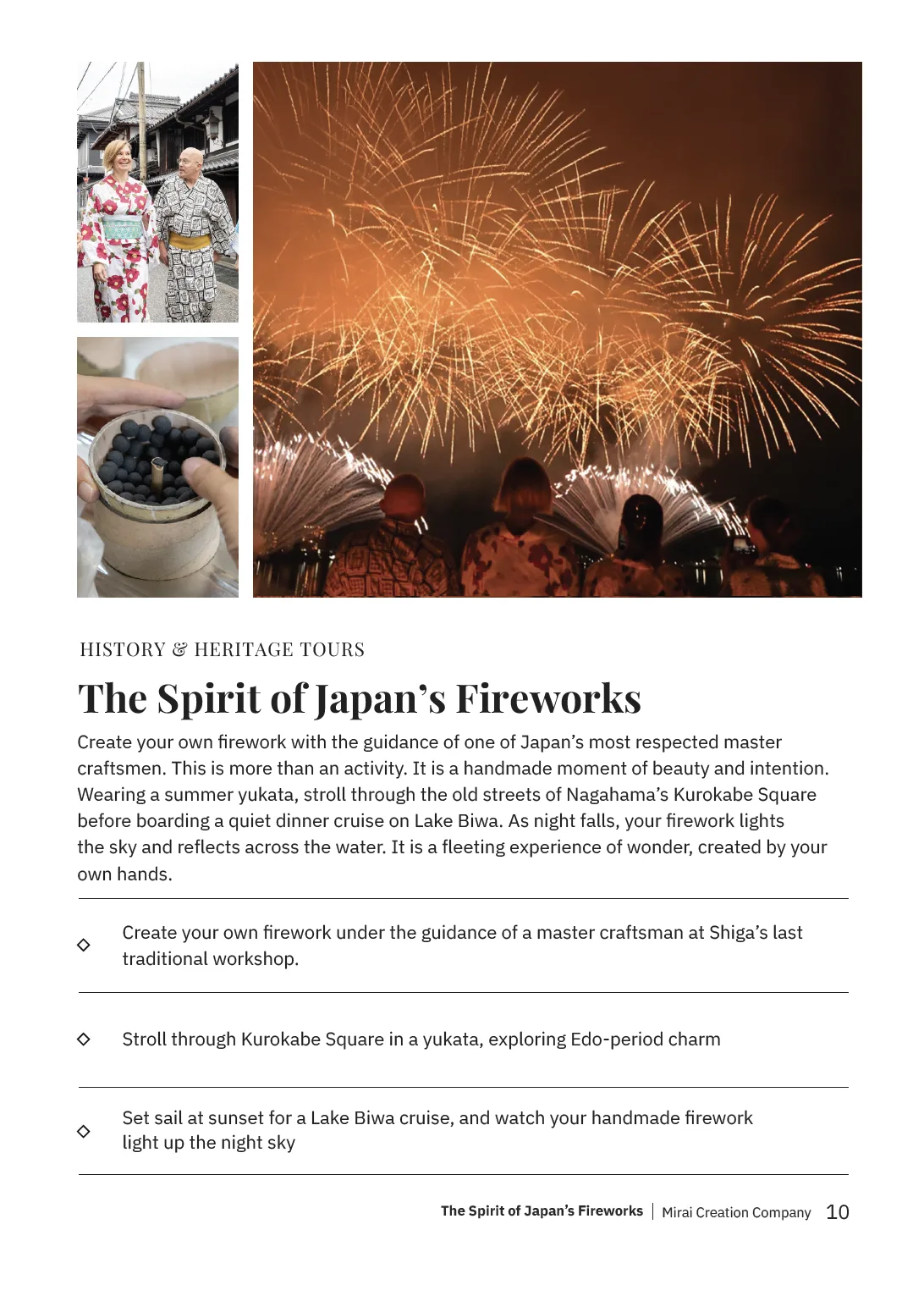
Partner booklet
To launch the new website, a partner booklet was designed for distribution to tour operators, travel agents, and cultural institutions across Japan. It had to function as a standalone sales tool, so every spread was structured to tell a complete story without requiring a presenter.
Logo explorations
Concepts for planned tour programs and regional projects. Each mark reflects the cultural identity of its area, designed to work at small sizes on printed materials and digital platforms alike.
Mascot and video
I created Mirai-kun, a shiba inu character used across social media, event materials, and the company's YouTube channel. I also edit the channel's vlog-style videos, where Mirai-kun serves as the recurring visual anchor. The tone is intentionally personal rather than corporate.

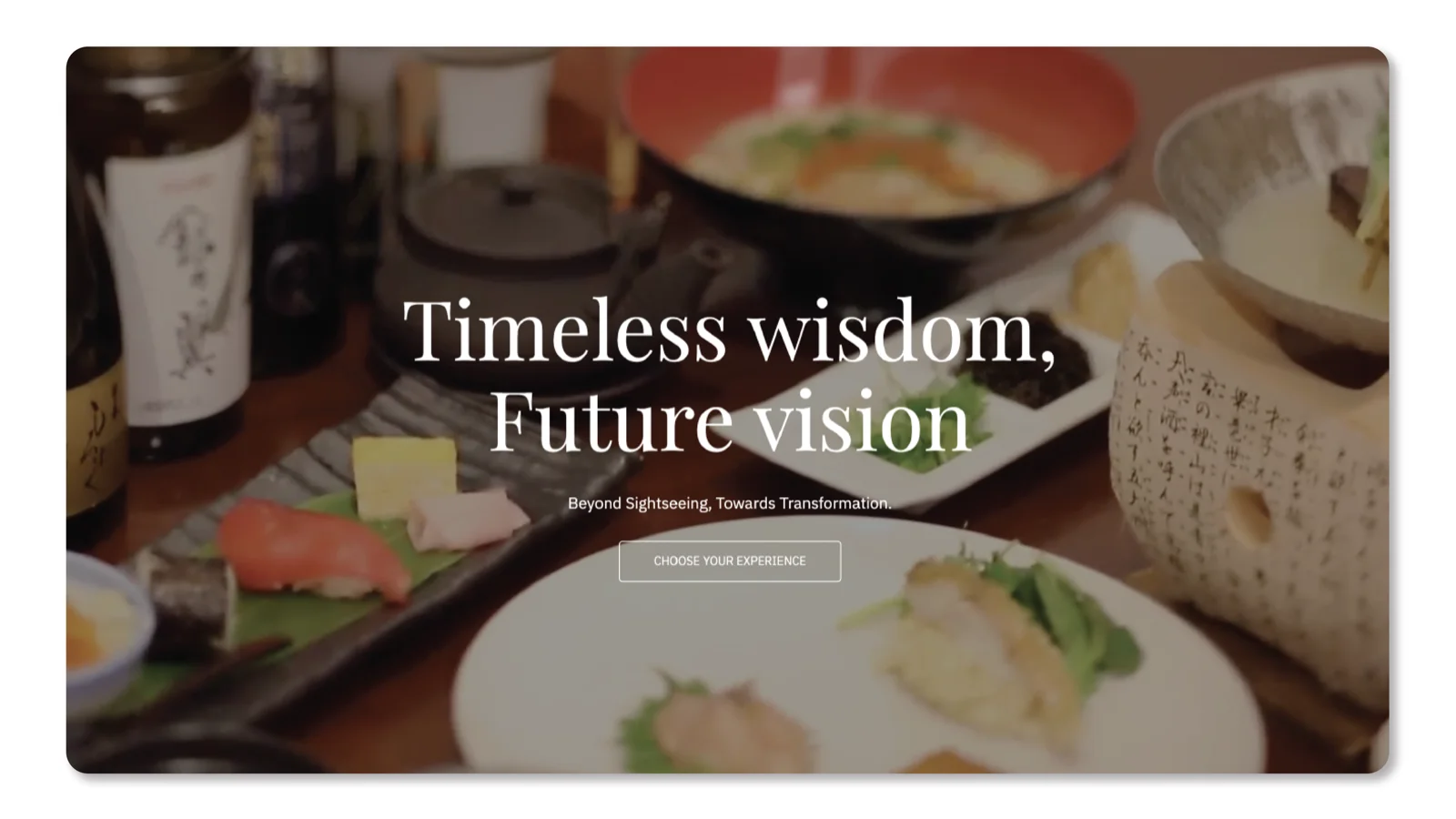
Japan Tea Action
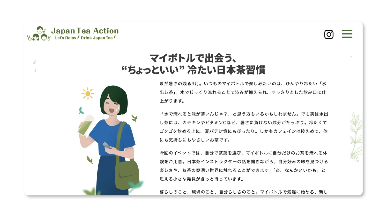
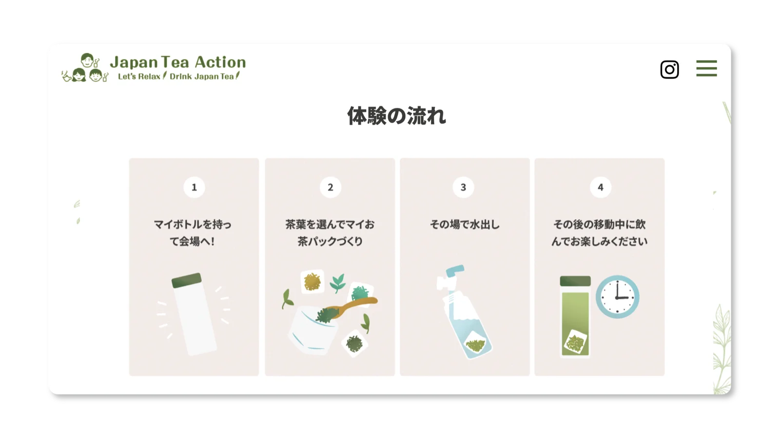
A campaign promoting Japanese tea culture to a wider audience. I designed the overall visual identity for the 2025 event, including all illustrations, posters, and key visuals. I also designed the campaign's website page. The direction leaned warm and approachable, matching the casual, community-driven tone of the initiative.
japanteaaction.jp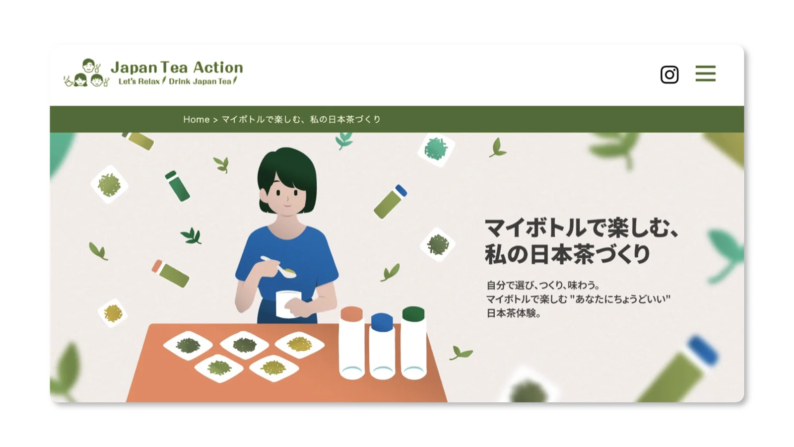
Credits
All design above is mine. A developer partner handled the tour site build and a translator supported the bilingual copy.
Reflection
The range came at the cost of depth. Shipping fast across web, print, mascot, and video every week meant the context-switching often cost more than the range was worth. What I keep wishing I had was time to stay with one problem long enough to solve it well, instead of moving on the moment it looked finished.