 manabiAI, the landing for Pantheon's AI and n8n automation course.
n8n is one of the fastest-rising tools in software. It passed 230,000 users in 2025, raised a round at a 2.5 billion dollar valuation, and finished the year as the most-starred open-source project on GitHub. The people chasing it skew young, online, and fluent in what a current product looks like.
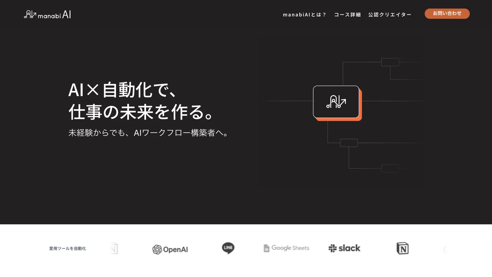
manabiAI is Pantheon's course for building AI automations with it: AI fundamentals, AI integrations, and real workflows in n8n. The hard part was internal. Pantheon's own house style is dated: its corporate site opens on a stock-photo sunset and a paragraph about Greek gods. Left to default, the course would have inherited that look and lost its audience on the first screen.
So underneath the client's content requirements sat a design problem. Make a course for a young, trend-aware audience feel current and credible, without the parent company's instincts pulling it back.
The audience is inexperienced but online-native, pulled in because AI and n8n are trending. They are cautious about paying for a course and quick to write off anything that looks behind the times. They respond to work that looks like the tools they already follow, to proof that people like them succeeded, and to the sense that this is where the trend lives, not a legacy training company chasing it.
Simple and modern design
A dark hero with a single warm accent gives the page energy and confidence, in place of the washed-out look of the parent site. It reads as modern before a word is read.
Speak the audience's visual language
The workflow motif and the strip of tools the audience already uses, OpenAI, Slack, Notion, LINE, tell a trend-aware visitor this is the thing they came for, with no jargon.
Illustrations over stock photography
The parent site leans on generic stock imagery. manabiAI uses one consistent set of modern isometric illustrations instead, a deliberate break from the company's default and a far better fit for who the page is for.
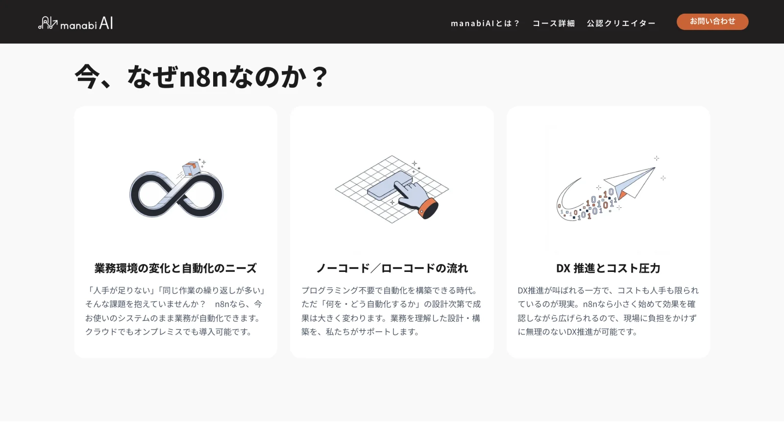 One illustration system across the site.
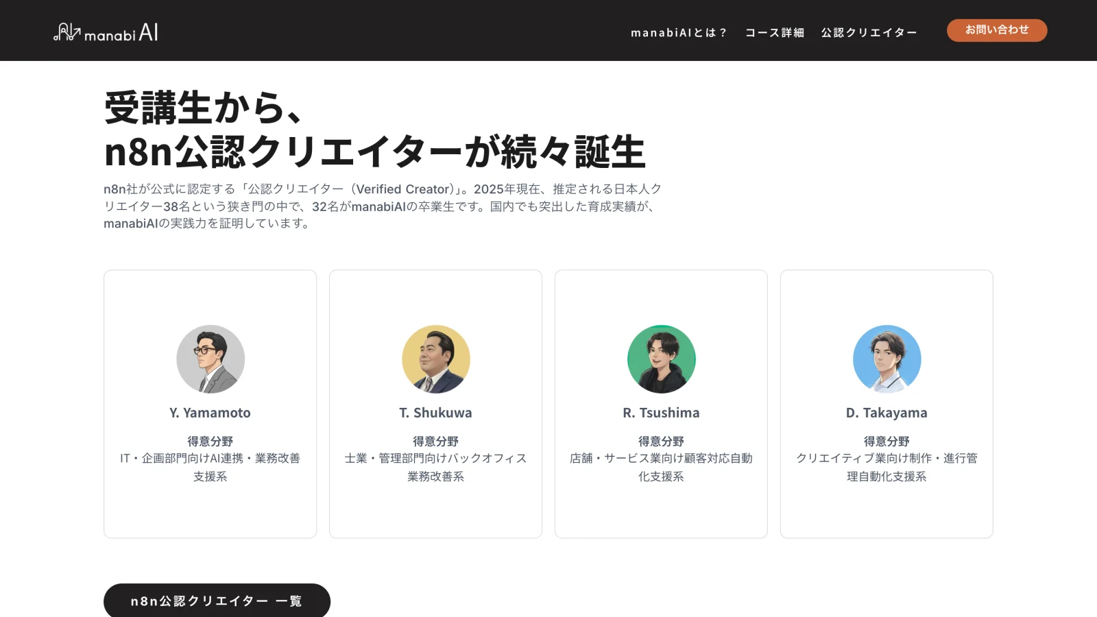 The creators section.
The client set the content and the structure. I was in charge of the visual system. The goal was to make something current enough to win skeptical young buyers, inside a frame set by a company whose own taste did not necessarily match.
The full site is live at manabiai.jp, across the home, course, and creator pages. It is the most current project that Pantheon has online.
The hard part was serving an audience whose taste was the opposite of the client's, without fighting the client. I also made this in Studio, a no-code web design tool I was new to, so learning it as I went was part of the work.