Sisterhood of the Knives
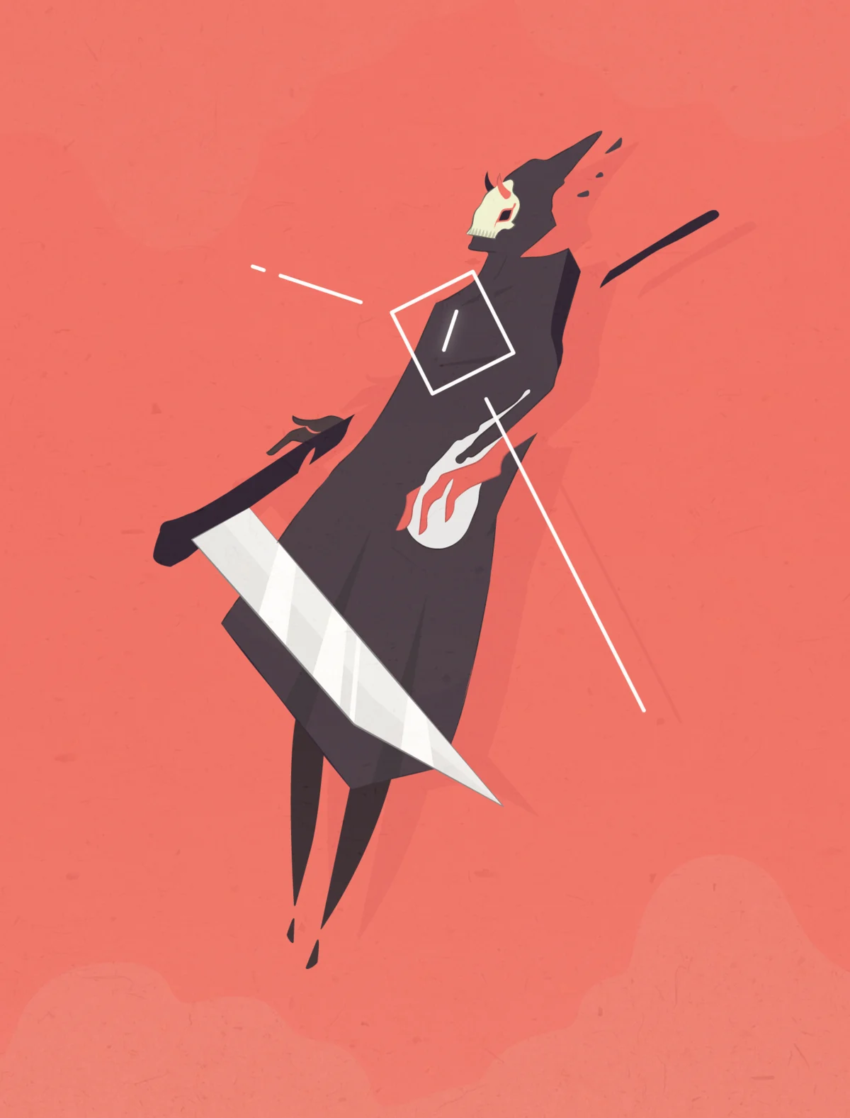
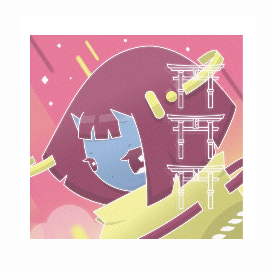
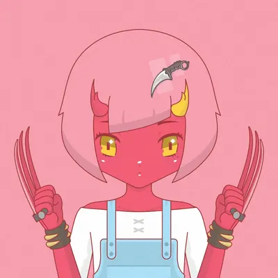
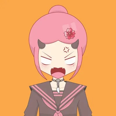
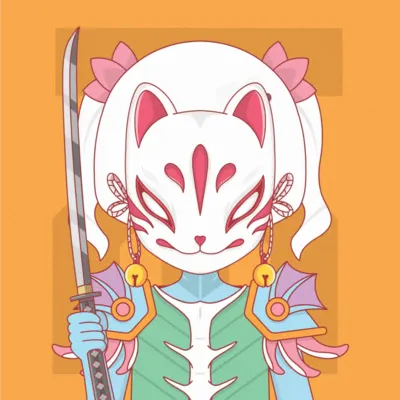
Sisterhood of the Knives (SOTK) is a dystopian story world expressed through a 2,000-piece generative character system. Released on Solana as an NFT collection, its lore follows rebel scientists who clone Hana, the last surviving Devi, into an underground sisterhood trained to resist the Solus Via. I developed the concept and visual system, produced approximately 80% of the illustration work, and led a three-person illustration team.
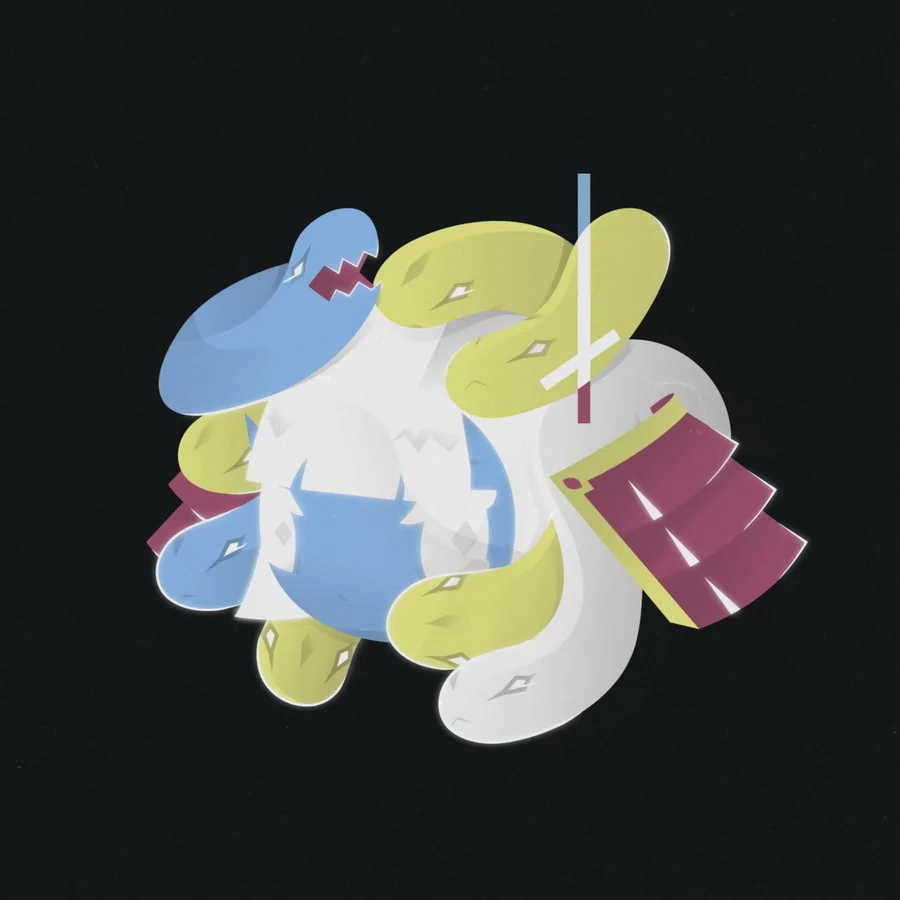
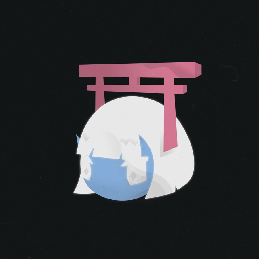
That narrative became a five-race character system with a layered rarity hierarchy and more than 200 interchangeable traits. Bodies, hair, hairpins, hands, weapons, accessories and backgrounds were drawn separately; every component needed to combine cleanly while preserving silhouette, colour balance and personality. At the 1/1 end of the system, Hana X, Hana 0, pastel variants and mutated Hanas extend the core races; mutated characters combine traits from two races. Across 2,000 outputs, I directed the team to keep the world, character logic and visual language consistent. The collection minted out and remains listed on Magic Eden.
- Role
- Concept, branding, lead illustrator
- Scale
- 2,000 characters, 200+ traits, five races
- Tools
- Adobe Illustrator, Photoshop, After Effects
- Team
- Led a three-person illustration team
One base, five races
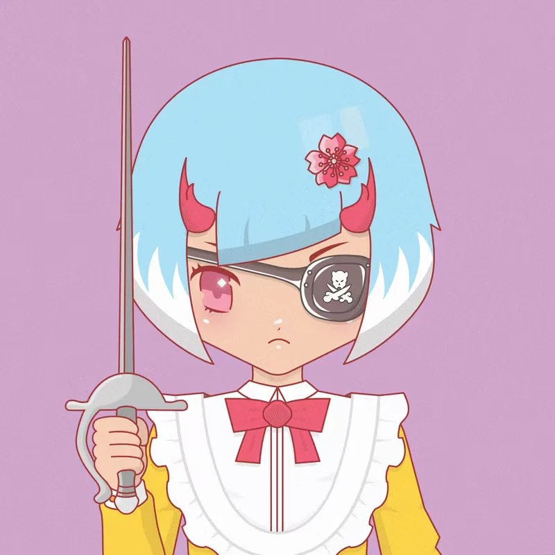
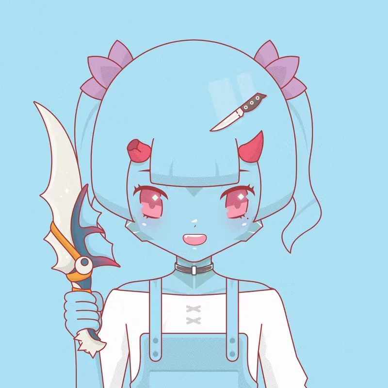
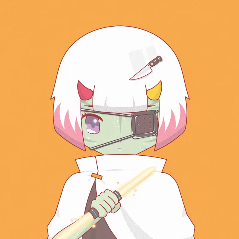
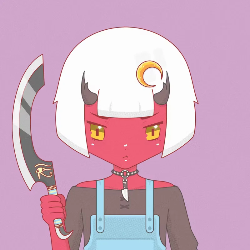
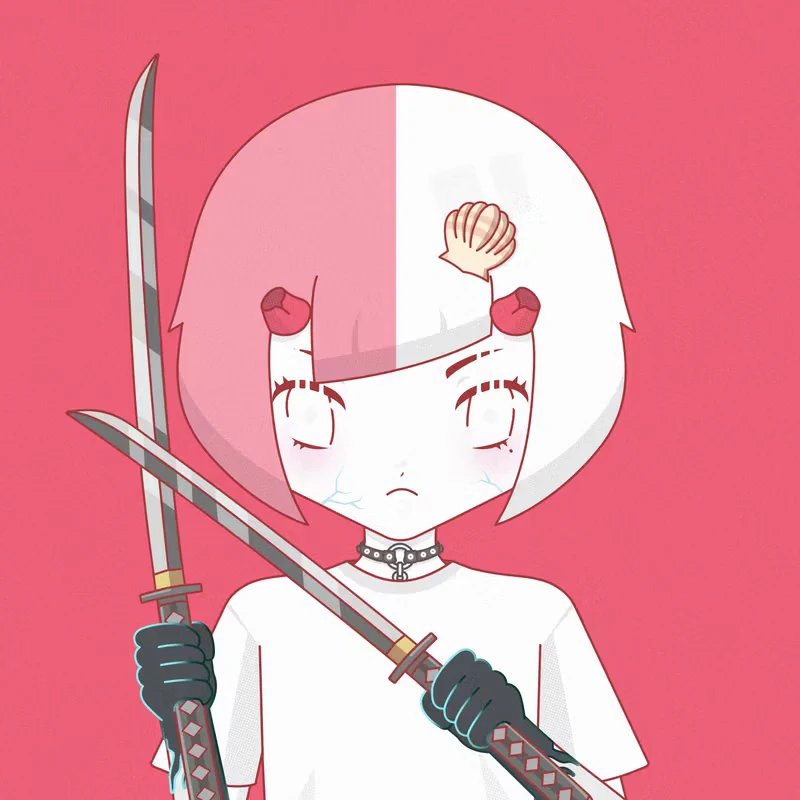
Core collectionThe core collection across all five races. Shared proportions and component rules let skin, horns, eyes, markings and weapons vary without breaking the silhouette or the visual language.
Pastel tier
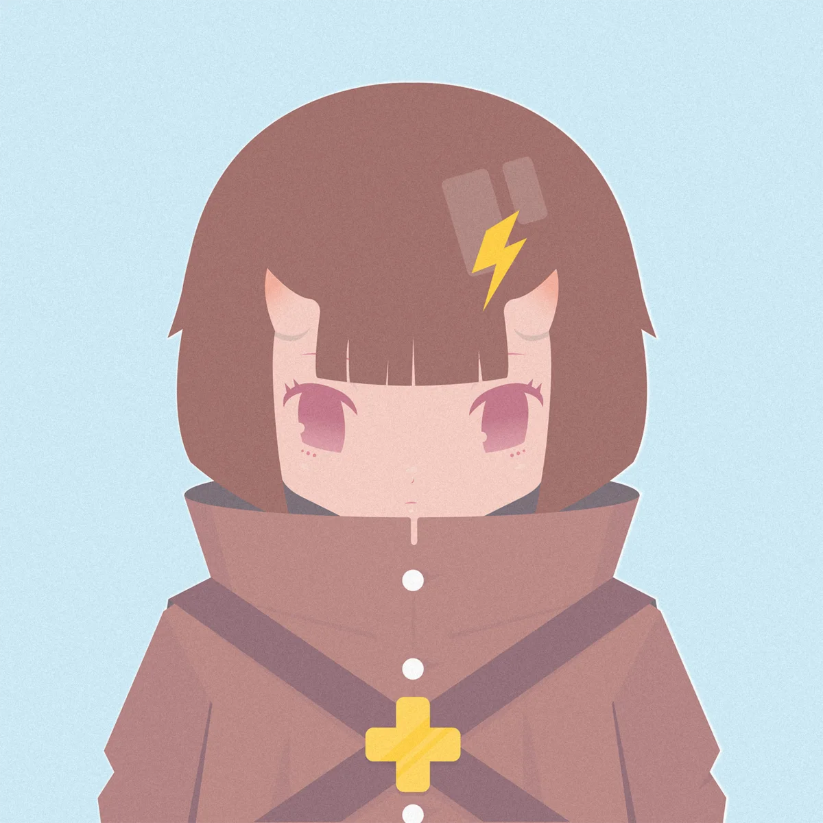
Higher rarityA rarer treatment of the same race system, with a restrained palette and a shared visual atmosphere across the set.
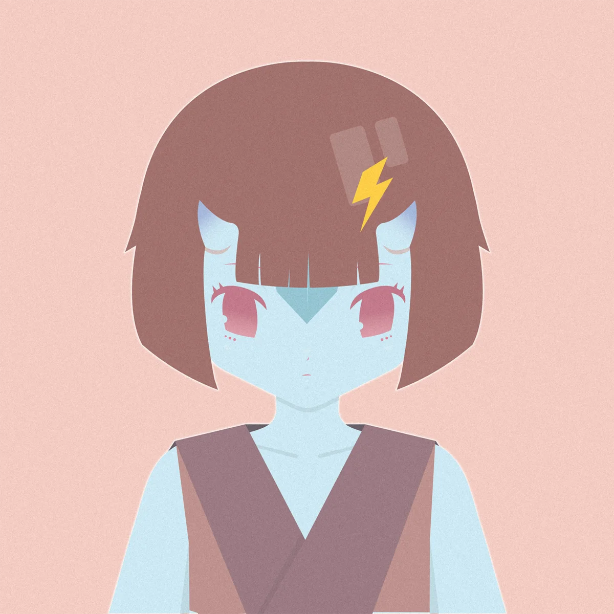
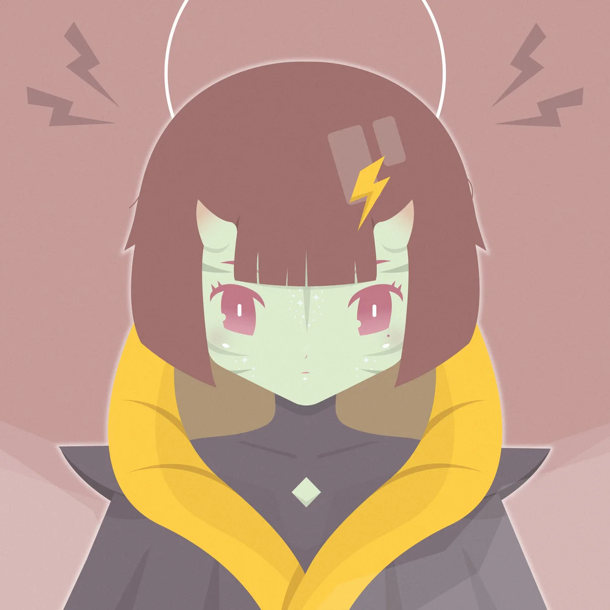
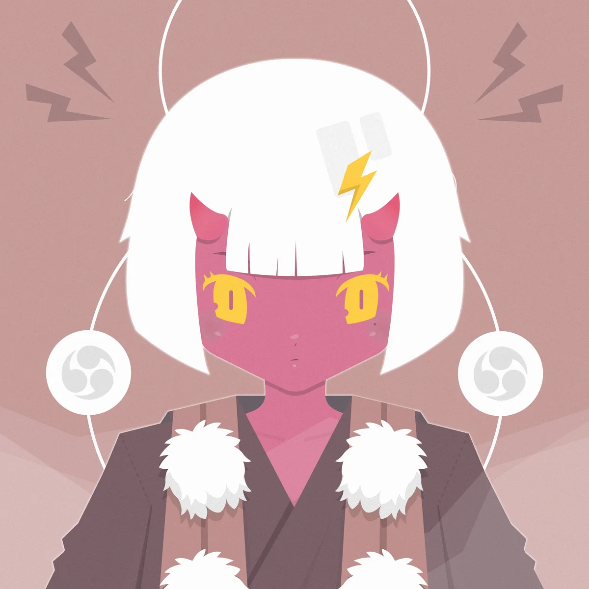
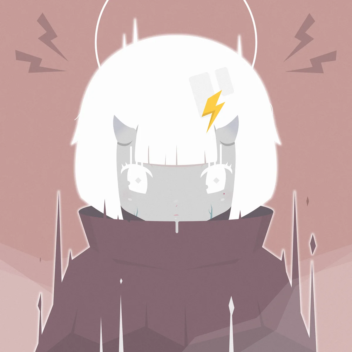
Hana X and Hana ZERO
Animated 1/1 editionsTwo unique characters from the 1/1 tier, individually animated as standalone editions.

Miraidukuri
Designer at a tourism and regional revitalisation company in Tokyo, creating logos, illustration systems, campaigns, motion and print for programmes across Japan.
Most of this work has to do two things at once: read as credible to an overseas traveller who knows nothing about the region, and read as respectful to the Japanese partners and municipalities who have to sign it off.
- Role
- Designer, brief to launch
- Scale
- Identity, campaigns, video editing, animations and print
- Tools
- Adobe Illustrator, Photoshop, InDesign, After Effects
- Team
- In-house design and cross-functional project teams
Logo creation
Four marks
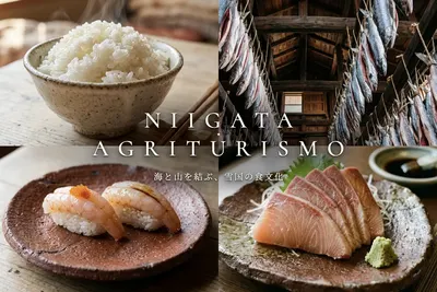
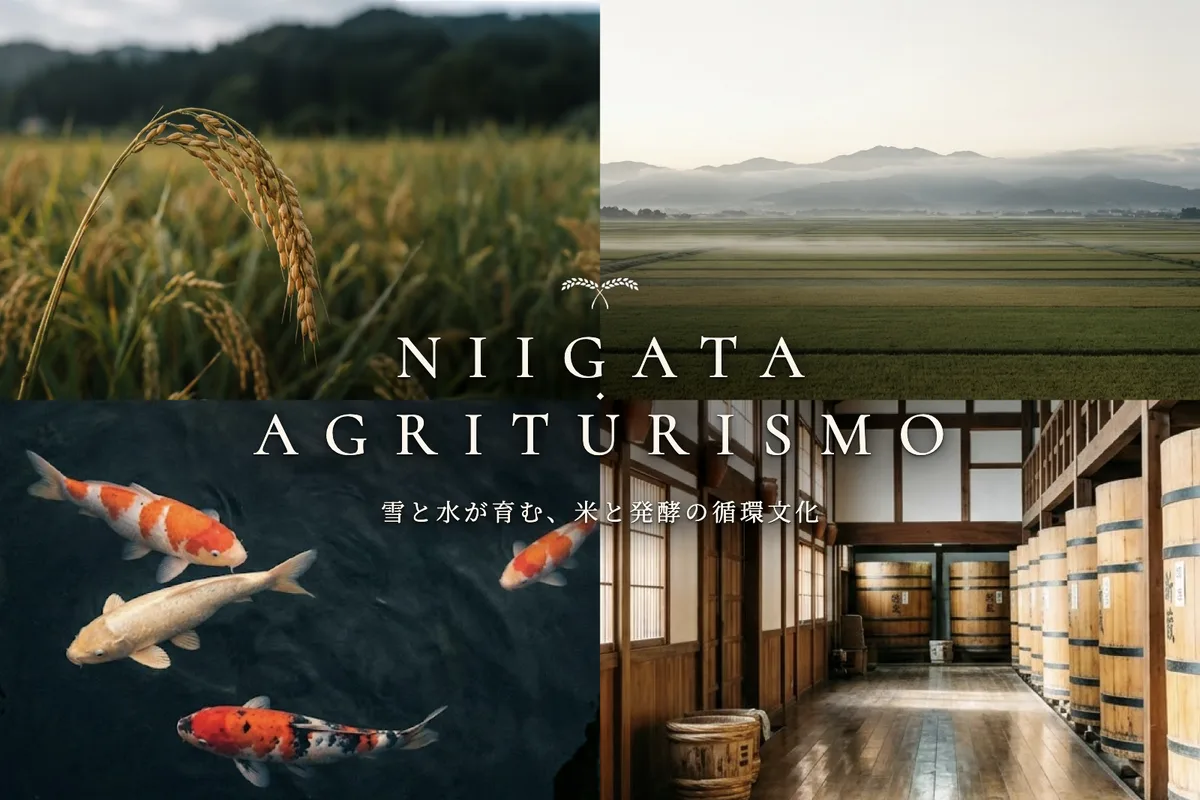
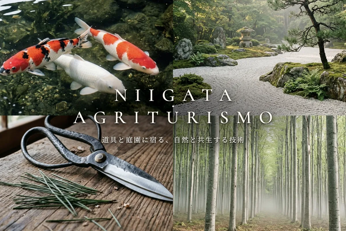
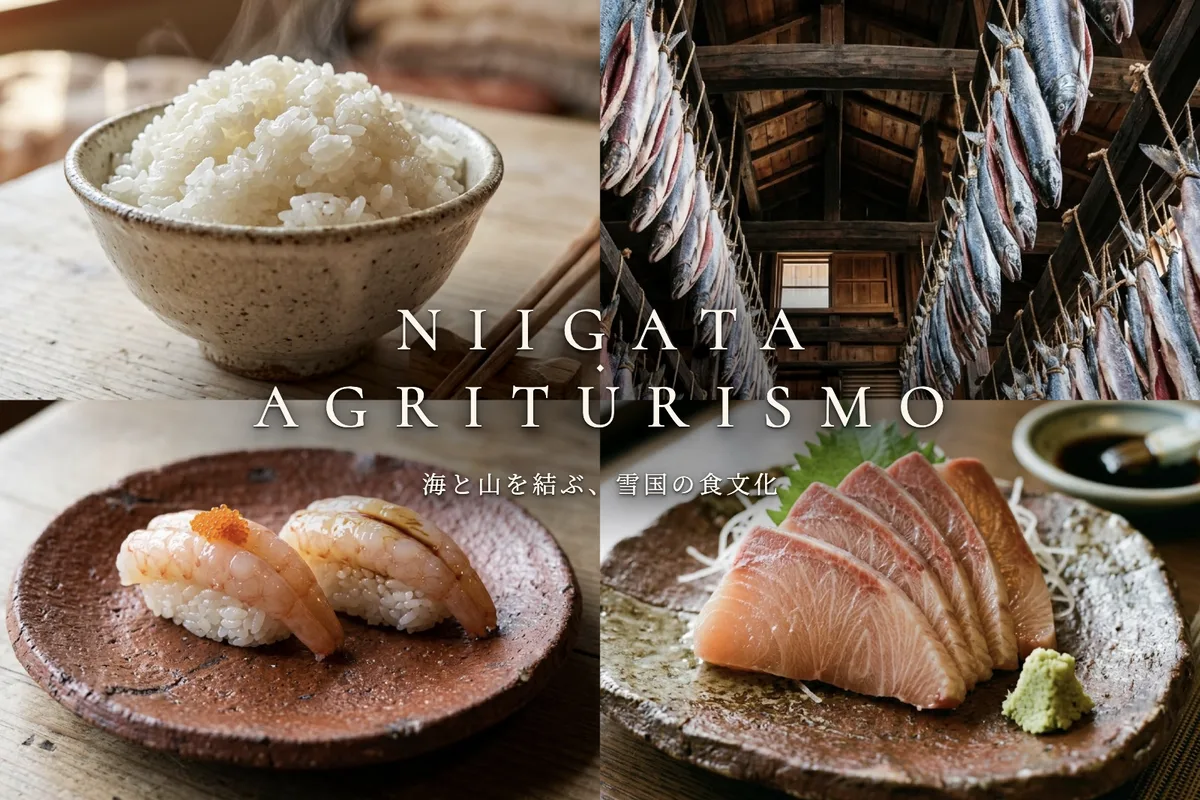
Niigata Agriturismo
ConceptBranding, logo, and key visual designs for a submission for a tourism program in Niigata.
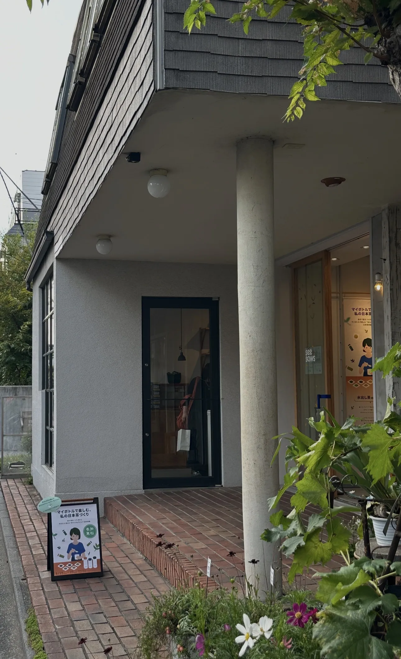
Japan Tea Action
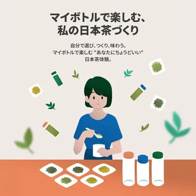
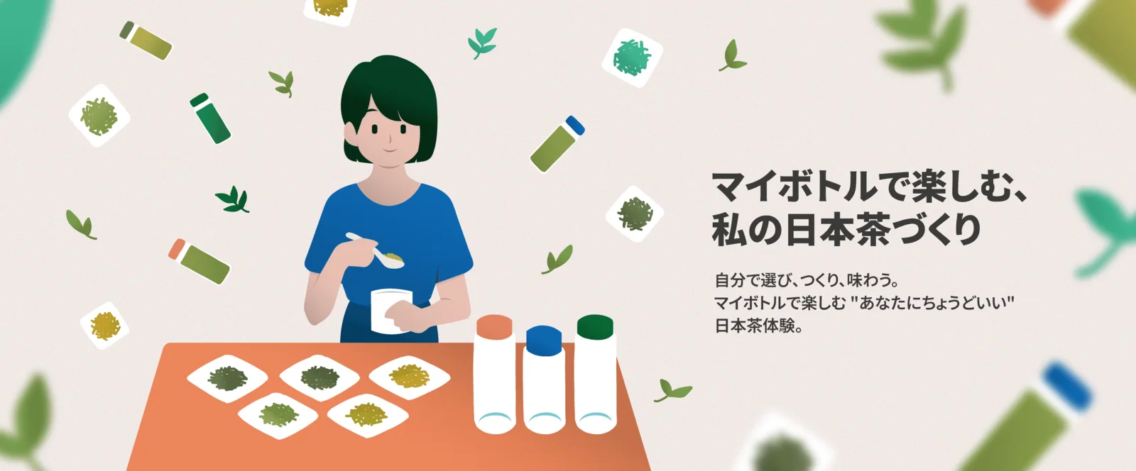
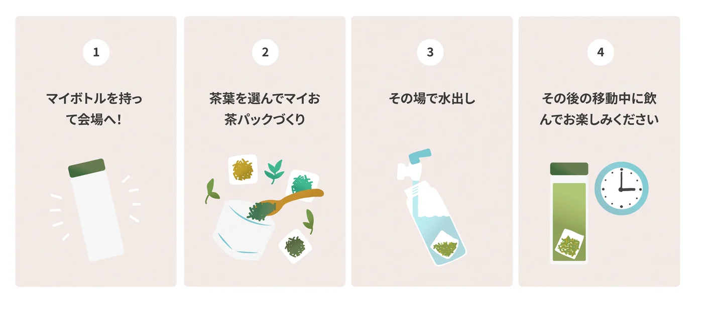
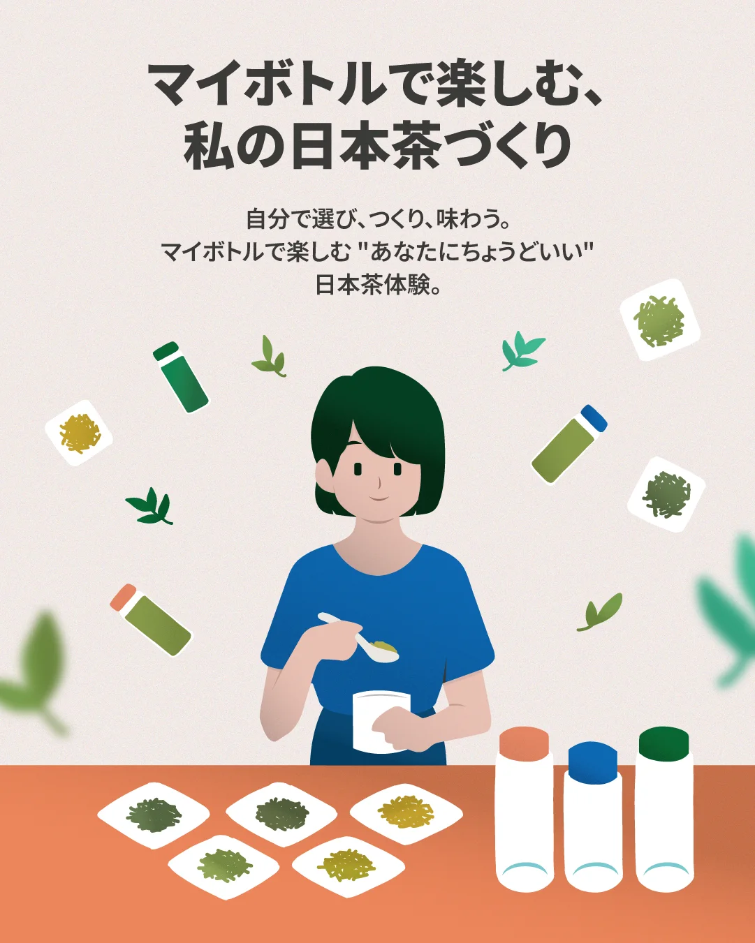
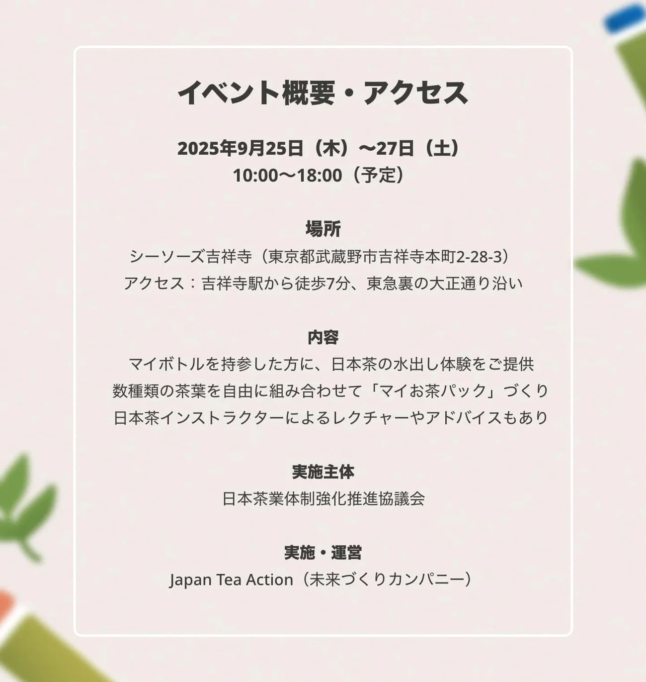
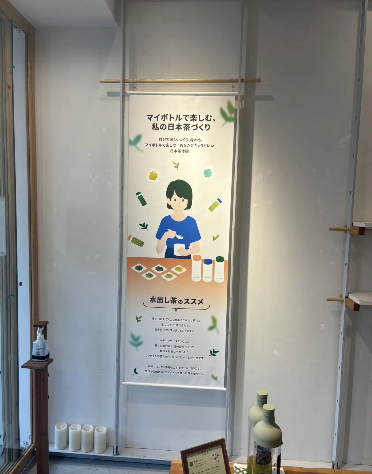
Campaign, end to endA my-bottle tea experience run at a shop in Kichijoji. I drew the illustration set and took it through every surface it needed to live on: the site, the process explainer, social, the event page, and a printed tapestry that hung in the venue.
Company channel
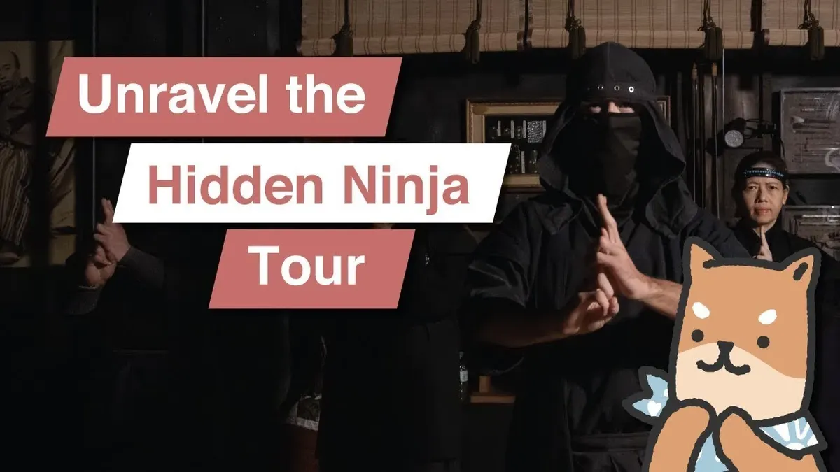
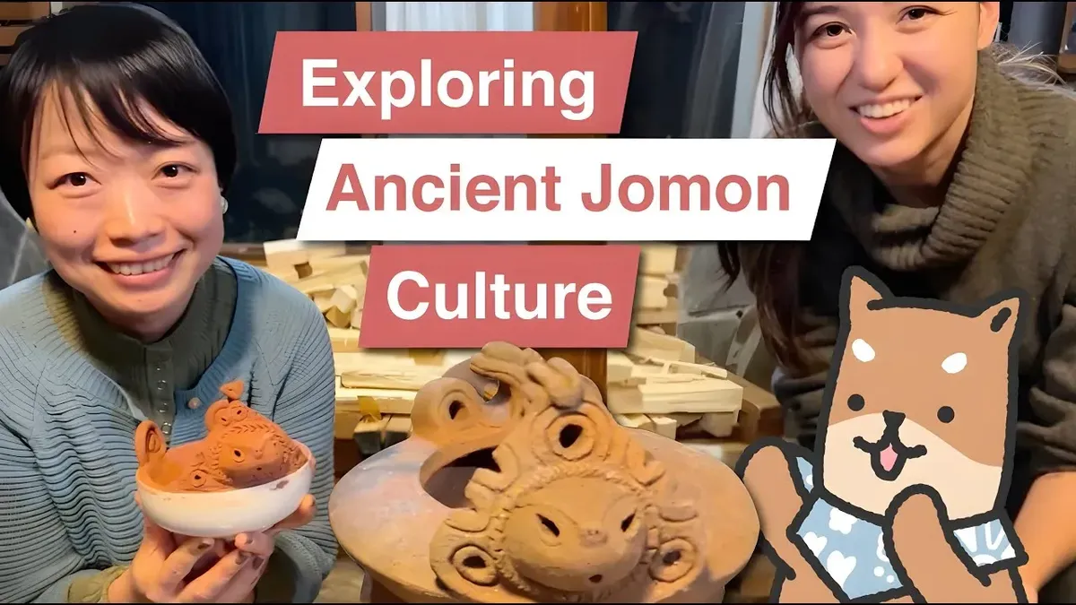
Video editingI edit the tour films for the company’s YouTube channel, cutting and titling them in Premiere Pro and After Effects so the brand reads the same on screen as it does in print.
Mirai-kun
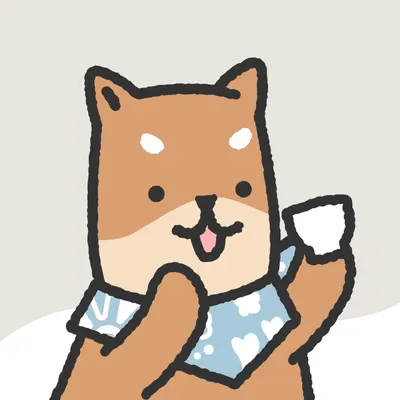
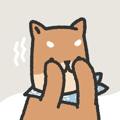
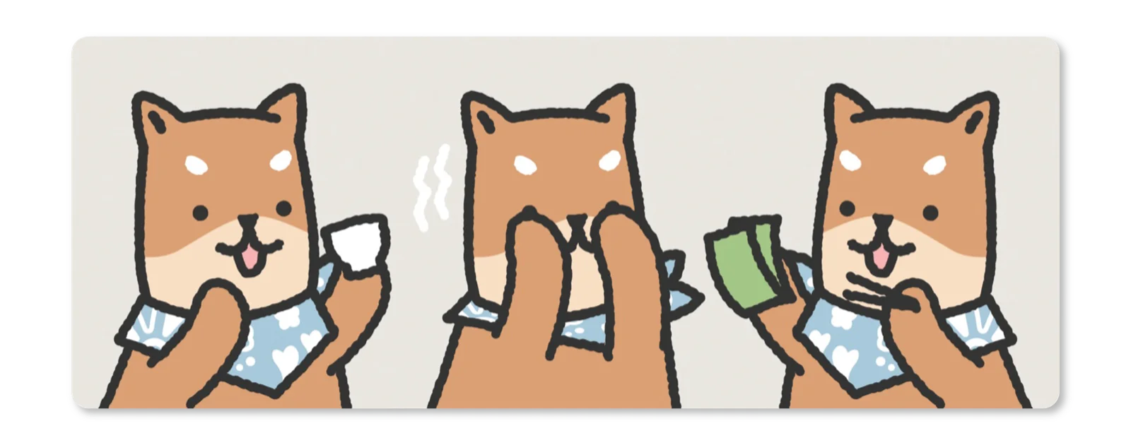
Mascot, print, motionA shiba inu character used across social, event materials and the company's YouTube channel. I draw him, and I edit the videos he appears in, so he stays the same character whether he is a sticker on a flyer or an overlay on a vlog.
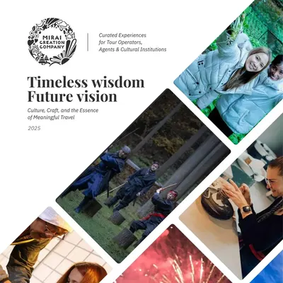
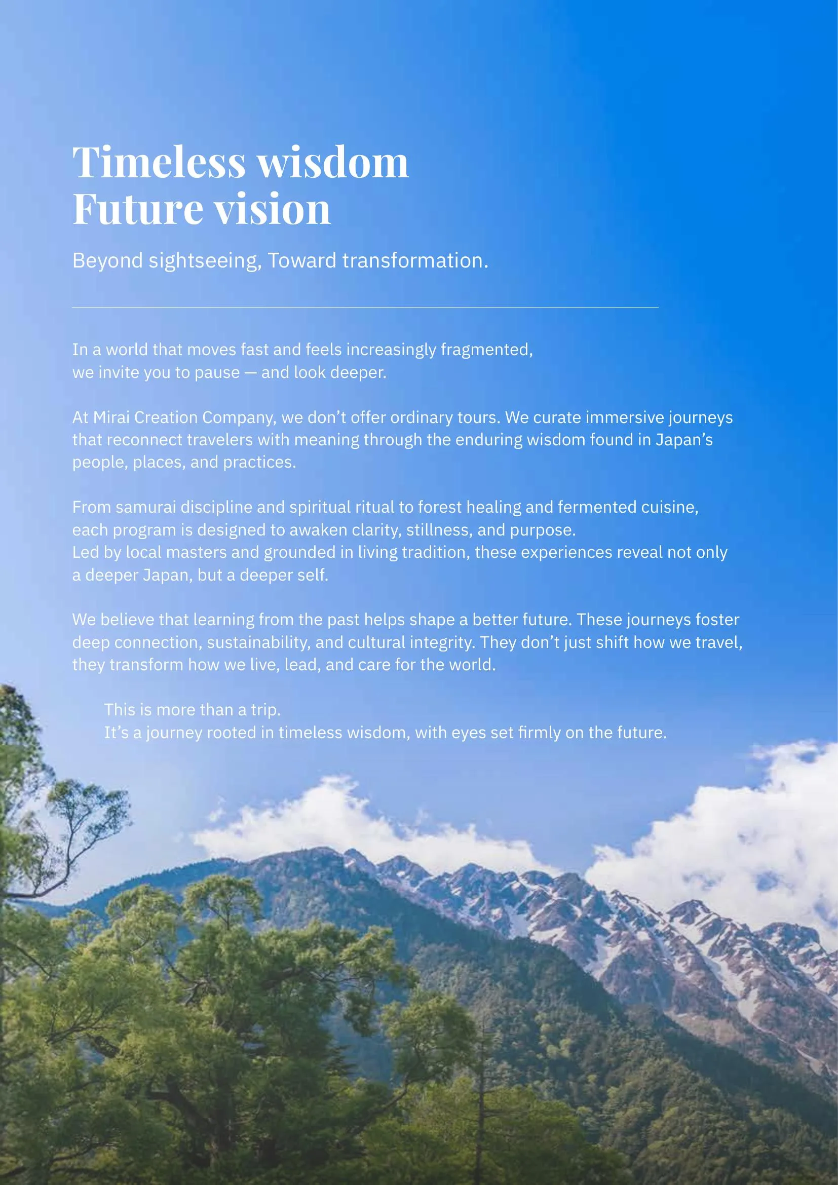
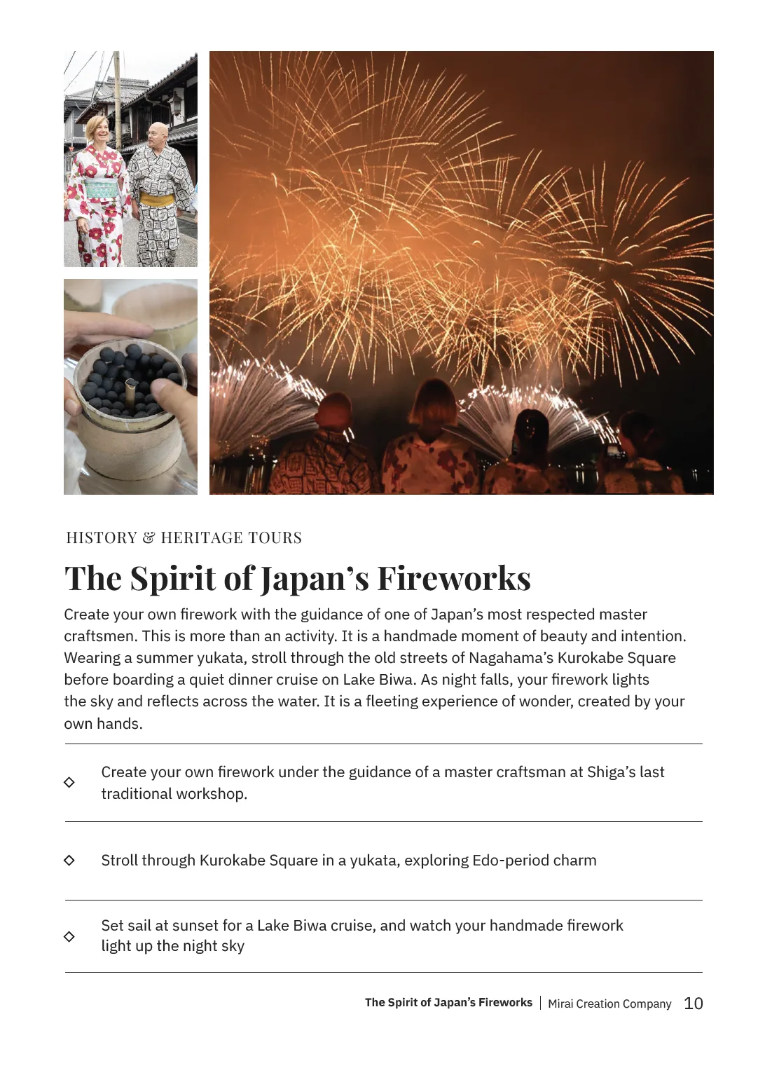
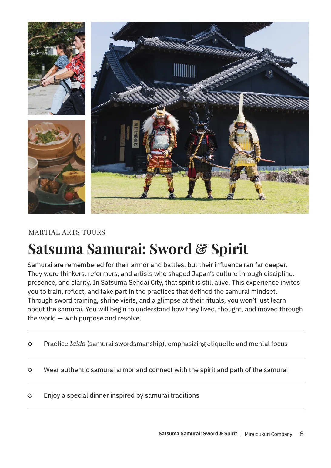
After completing the website redesign, we started advertising through brochures placed in hotels, doubling as a downloadable kit we could send to businesses. I carried the revamped website’s language over to the brochure. Elegant yet minimal.
Enjin
A bilingual product and identity system connecting international students with Japanese employers.
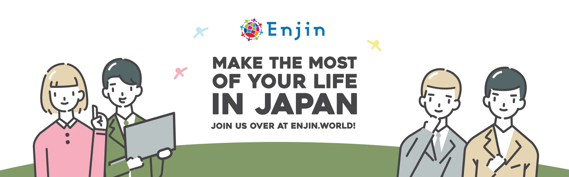
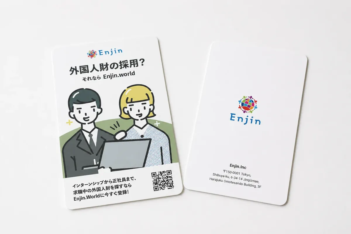
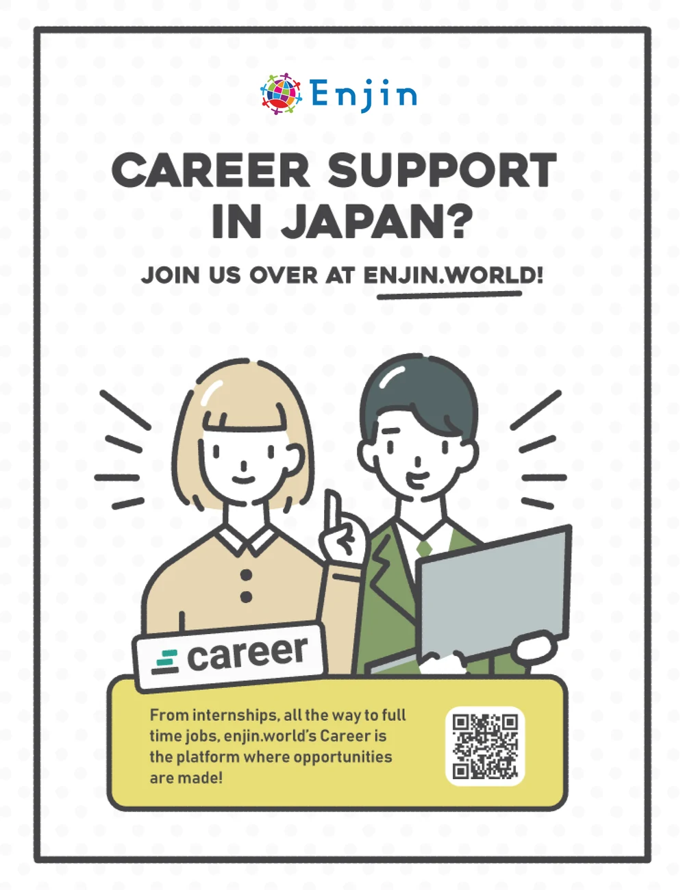
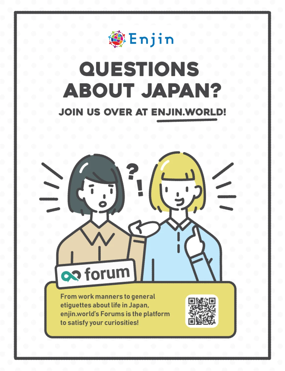
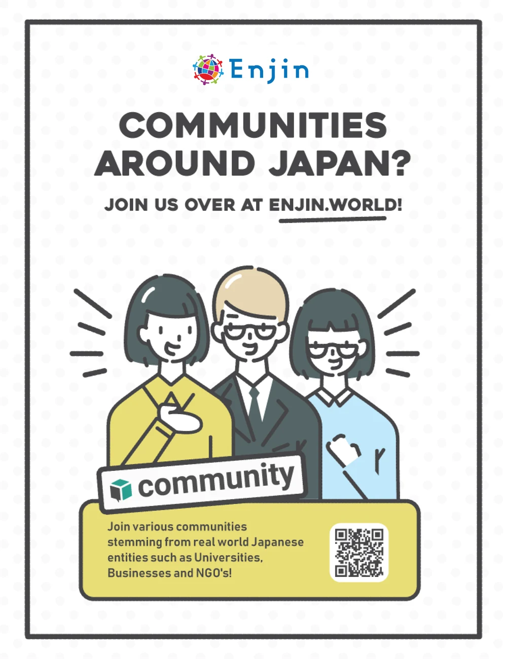
Enjin.world was a Tokyo-based startup helping international students find jobs and build professional networks in Japan. I worked across product design, branding and illustration, taking ownership of the company’s design output. User research showed that the platform needed three clearly defined areas: Career, Forum and Community. I developed a distinct mark for each within one cohesive identity system. The visual language balanced approachability for students with the credibility expected by Japanese companies, while remaining clear across languages and cultures.
- Role
- Product designer, brand designer and illustrator
- Scale
- Bilingual web app, three product areas and supporting brand collateral
- Tools
- Adobe Illustrator, Photoshop, InDesign
- Team
- Sole designer within the startup team

Event collateral
Career events & embassy displays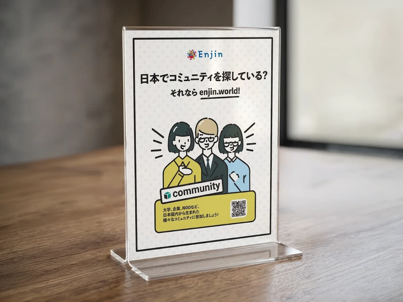

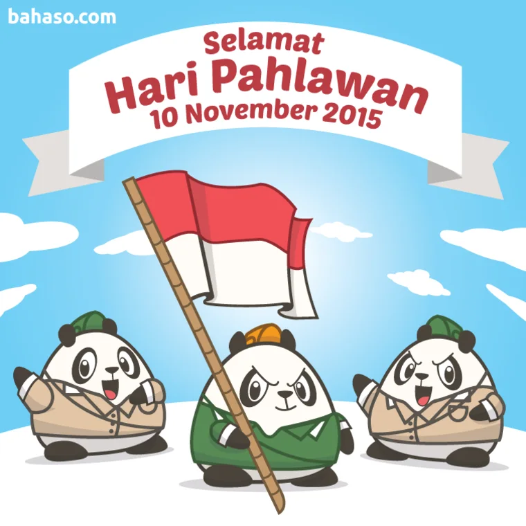
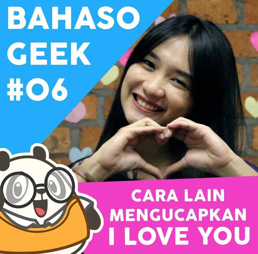
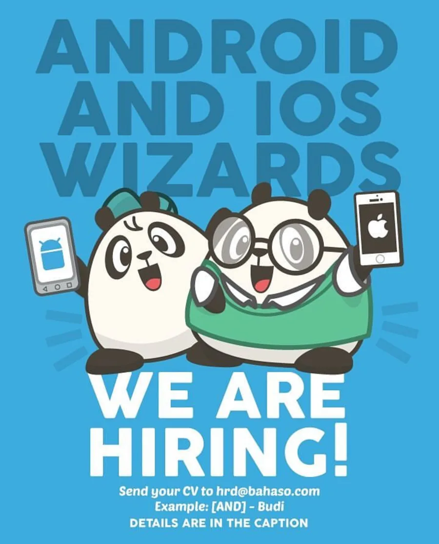
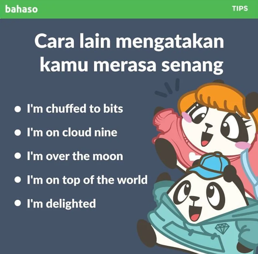
Bahaso
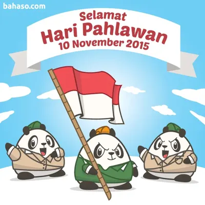
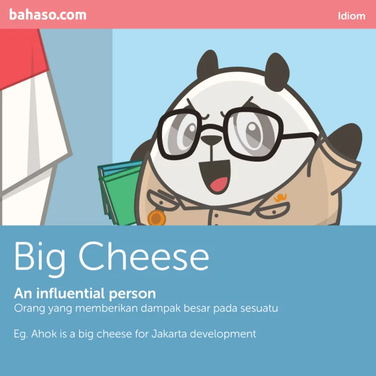
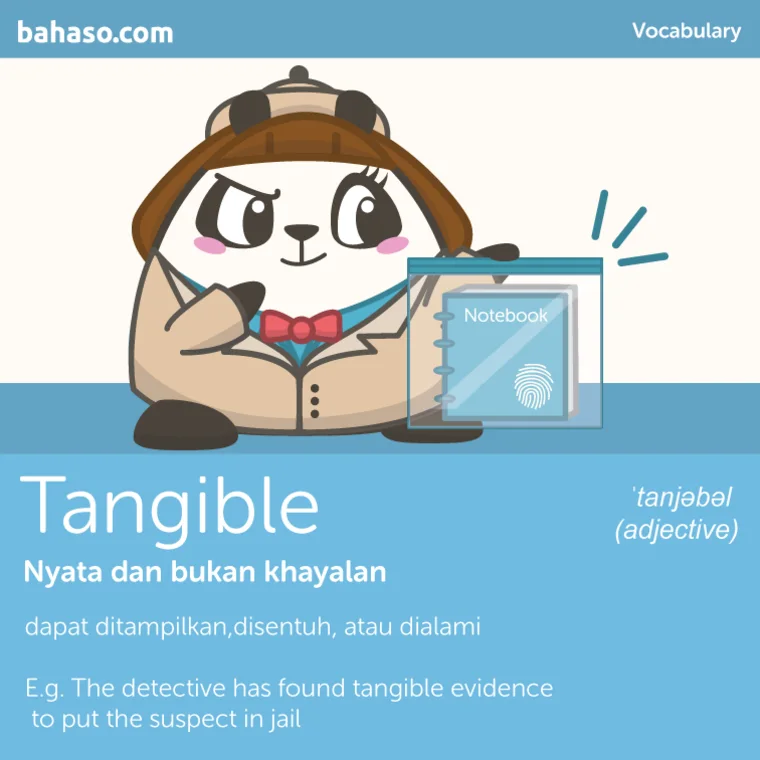
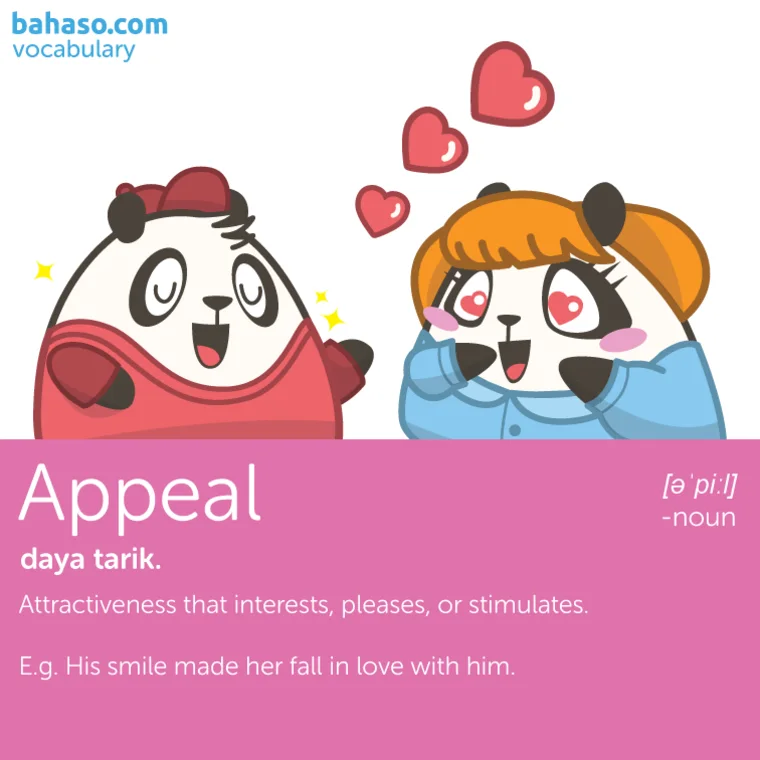
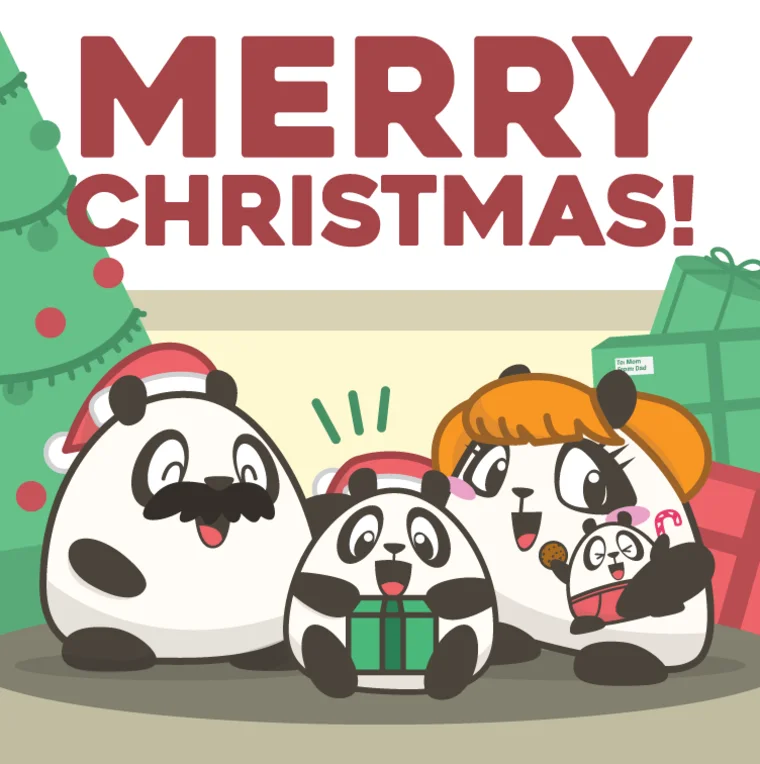
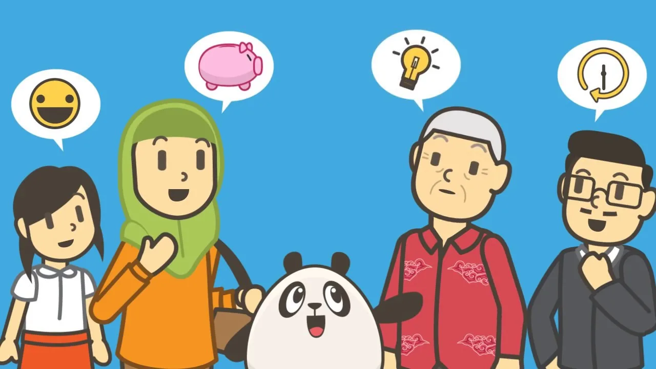
A panda mascot carried across hundreds of daily social pieces for an Indonesian language-learning app, plus educational animation and marketing video.
The interesting constraint was consistency at volume: the same character had to read correctly across idiom cards, vocabulary cards, national holidays, celebrity collaborations and recruitment posts, in two languages, every day for two years.
- Role
- Illustration, animation, layout and social design
- Scale
- Hundreds of social and app content assets, two languages and two promo videos
- Tools
- Adobe Illustrator, Photoshop, After Effects
- Team
- In-house marketing and content team

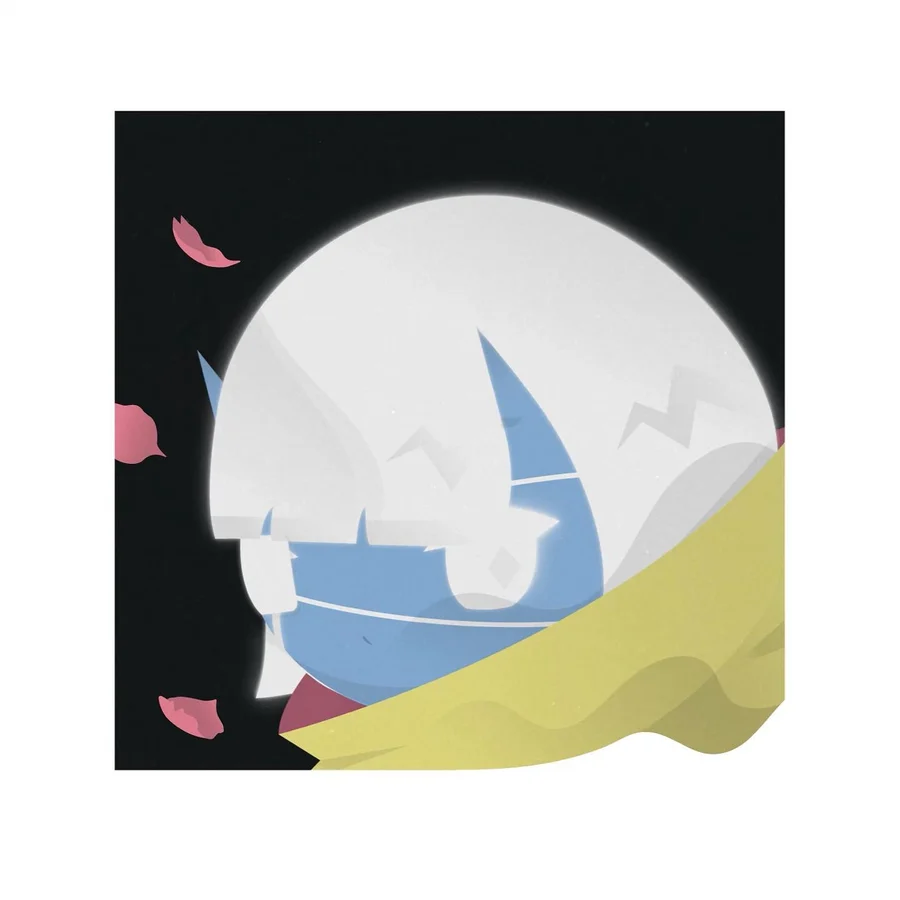
1/1 artworks, as ktsn
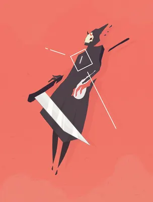
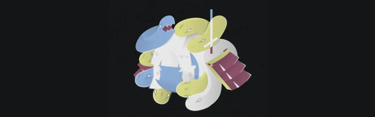
Fourteen pieces made in my own time under the name ktsn. They feel gentle and minimal on the surface, with something slightly "off" underneath.
Released across Foundation, Formfunction, Hic et Nunc, Rarible and OpenSea, some as commissions for other collections.
- Role
- Independent illustrator and animator
- Scale
- Fourteen pieces, seven animated
- Tools
- Adobe Illustrator, Photoshop, After Effects
- Team
- Self-directed personal practice